Overview
The file uploader allow users to select one or more files to upload to a specific location.
This component is best suited to situations where multiple files are being uploaded. There are 2 ways to upload – via drag and drop or file selection via search.
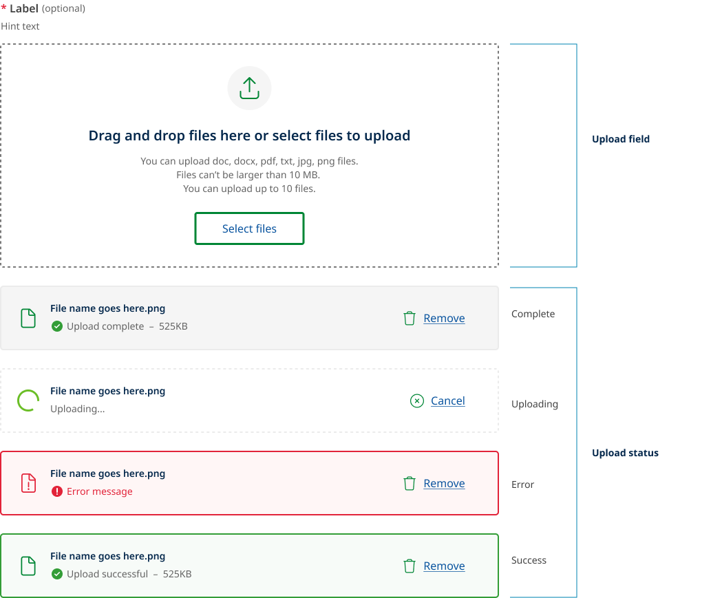
The component is comprised of two main parts, the 'upload field' and the 'upload status'.
File upload example without javascript api
The example below excludes the JavaScript API so does will not feature all advanced functionality like showing loading states.
<!--
Light: <div class="qld__form-file-wrapper">
Dark: <div class="qld__accordion-group qld__form-file-wrapper--dark">
-->
<section class="qld__body">
<div class="container-fluid">
<!-- Form for file upload, with multipart form-data encoding -->
<form action="/" enctype="multipart/form-data" class="qld__form--validate" novalidate="novalidate">
<!-- File upload compoent -->
<div class="qld__form-group qld__form-group--file-upload">
<!-- Label for file input; includes required field indicator -->
<label class="qld__label" for="ij-field__resources">
Upload documents
<abbr title="required">*</abbr>
</label>
<!-- Hint text for uploading documents -->
<em class="qld__hint-text" id="ij-field__resources_description">Hint text</em>
<!-- File input wrapper with dropzone and additional file upload instructions -->
<div class="qld__form-file-wrapper sq-form-question-answer">
<div class="qld__form-file-dropzone">
<!-- File input icon and upload status indicator -->
<div class="qld__file-input-icon">
<!-- Decorative icon, hidden from assistive technologies -->
<i class="fa-light fa-2x fa-arrow-up-from-bracket" aria-hidden="true"></i>
<!-- Upload progress indicator (only displays while files are uploading) -->
<div class="qld__loading_spinner qld__loading_spinner--landscape" role="status">
<span class="qld__loading_spinner-wheel"></span>
<div class="qld__loading_spinner-label qld__display-md">Uploading...</div>
</div>
</div>
<!-- Instructions for uploading files, including drag-and-drop and file selection options -->
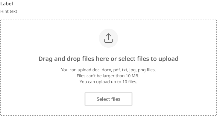
<p class="qld__file-input-title">
<span>Drag and drop files here or </span>select files to upload
</p>
<!-- Constraints for file uploads -->
<div class="qld__file-input-constraints qld__caption">
<span>You can upload docx, doc, pdf files.</span>
<span>Files can't be larger than 10 MB.</span>
<span>You can upload up to 3 files</span>
</div>
<!-- Actual file input, hidden for styling purposes; labelled by external elements and described by hint -->
<input id="ij-field__resources" class="qld__file-input visuallyhidden" name="file|resources[]" type="file"
accept=".docx,.doc,.pdf" data-files="" data-file-types=".docx,.doc,.pdf"
data-max-size="10" data-max-files="3" data-js-api="false" multiple="" required=""
aria-describedby="ij-field__resources_description">
<!-- Accessible button label for triggering file input dialog -->
<label class="qld__file-input-label qld__btn qld__btn--secondary" for="ij-field__resources">Select files</label>
</div>
<!-- Preview area for selected files -->
<div id="ij-field__resources-preview" class="qld__form-file-preview"></div>
</div>
</div>
</form>
</div>
</section>
Upload field behaviour
The upload field comprises a drag and drop region, a select files button, an upload icon, form label and hint text, an upload heading, and a file upload description.
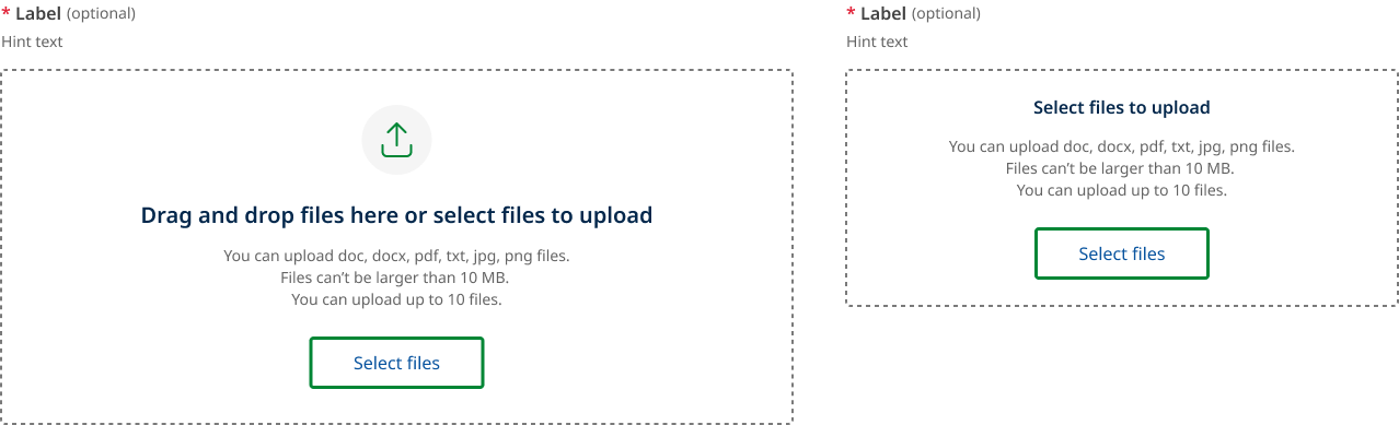
Desktop and mobile
The upload field on desktop has a larger area to make drag and drop functionality easier.
On mobile since it is uncommon to use drag and drop functionality the heading changes to only state “Select files to upload”.
The feature icon is also removed to save vertical space.
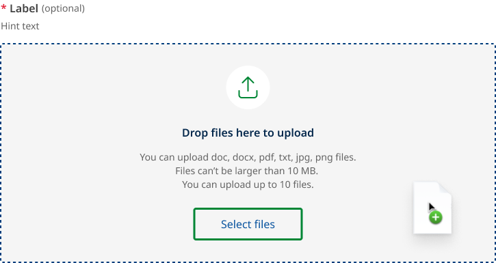
Drag and drop
This state will appear when a file (or files) are dragged from outside the browser window over the target area.
When dragging a file into the drop zone region the text changes to say “Drop file here to upload” the background also changes and the outline darkens. The design of this state mirrors what happens on other form fields during hover states.
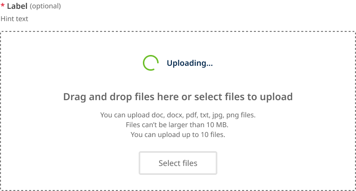
Disabled while uploading
If your environment does not support a user uploading additional files while others are still in the progress of being uploaded. The upload field will change to a disabled state until all active files have been processed.
When this state is active the upload icon is replaced with a loading spinner.
This is state may or may not be used depending on your implementation.
Disabled
This is the standard disabled state for file upload field.
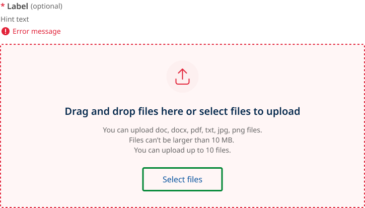
Error
This is error state for the overall input field. It is based on invalid state for standard form fields.
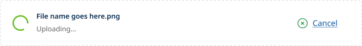
File upload status
There are three groups of file upload status:
- loading
- uploaded and
- error.
Loading status
The example below shows the files loading state of a file while it is being uploaded. This state will appear while a file is being uploaded. Once complete, it will validate the upload against the supplied parameters and transition to either an uploaded or error state.
If file removal is not instantaneous then the landing state can also be used to indicated that a file is being removed form the list. In this situation the text changes to ‘Deleting...’
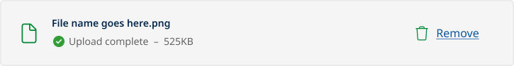
Uploaded status
An uploaded file will appear as shown below. Users have the option to remove uploaded files.
There are to types of validation for uploaded file:
- Upload complete
- Upload successful
Upload complete
Upload complete i is used for client side validation that the file has been uploaded and is ready to be submitted. This state is used when is not actually stored yet in the file hosting service but has passed validation.
If your file upload implementation validates and stores the file directly into the file hosting service before the form is submitted your will not require the upload complete status shown above, instead the file should use the upload successful status below.
Upload successful
Upload valid is a secondary validation state used indicate the file has been successfully stored or submitted.

Error status
When a specific file cannot be uploaded successfully it will show an error state.
There are two types of error messages based on the accompanying action:
- retry upload
- remove upload
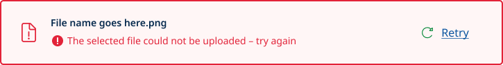
Error retry upload
This is given when a document upload has failed due to a network connection issue, sever error, glitch or timeout.
When the retry button is pressed the file will attempt to upload again.
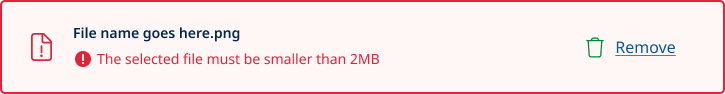
Error remove upload
Retry is disabled and replaced with remove for the following errors:
- File size limit exceeded
- File type not supported
- File name already exists
- File count exceeded
- Filename contains invalid characters.
- File did not pass virus scan
Usage guidelines
When to use
- You should only ask users to upload something if it’s critical to the delivery of your service (GOV.UK, n.d.).
- When a user needs to upload one or more files (Siemens, 2024).
When not to use
When documents are optional. Avoid asking users to provide documents if you don't require them (Digital NSW, n.d.).
How to use
Do
- Upload selected files instantly as they are selected or on submission (Digital NSW, n.d.).
- Be considerate of asking for large files, as some users may have limited band width or data (Digital NSW, n.d.).
- specify accepted file types, maximum file size and whether the user can upload one file at a time or several at once (DAFF, 2024).
- Include hint text to provide more general information about the field/file (DAFF, 2024).
- Indicate file uploading state (DAFF, 2024).
- Indicate a successful file upload using a Page alert, including file name (DAFF, 2024).
- Indicate unsuccessful file uploads using a Page alert with a meaningful error message, solution and support contact (DAFF, 2024).
- Allow multiple file formats as not everyone has access to the same software )US Government, 2022).
- Once a user uploads something, automatically check it for errors (Shopify, n.d.).
- Make use of the ‘instant upload’ pattern if your backend supports it (DAFF, 2024).
- Truncate file names when they extend beyond the width of the parent element (Digital NSW, n.d.).
Do not
- Add a secondary submit file button inside a form for the upload component (DAFF, 2024).
- Use in modals or page alerts (DAFF, 2024).
- Skip file validation checks can result in issues such as uploading files of incorrect formats or sizes, leading to potential errors down the line (OWASP, 2024).
- Ignore security concerns File uploads can pose security risks if not properly handled. Take measures to prevent potential security vulnerabilities, such as implementing file type validation to prevent malicious uploads and ensuring secure storage of uploaded files (OWASP, 2024).
File upload anatomy
The anatomy of file upload component consists of several elements:
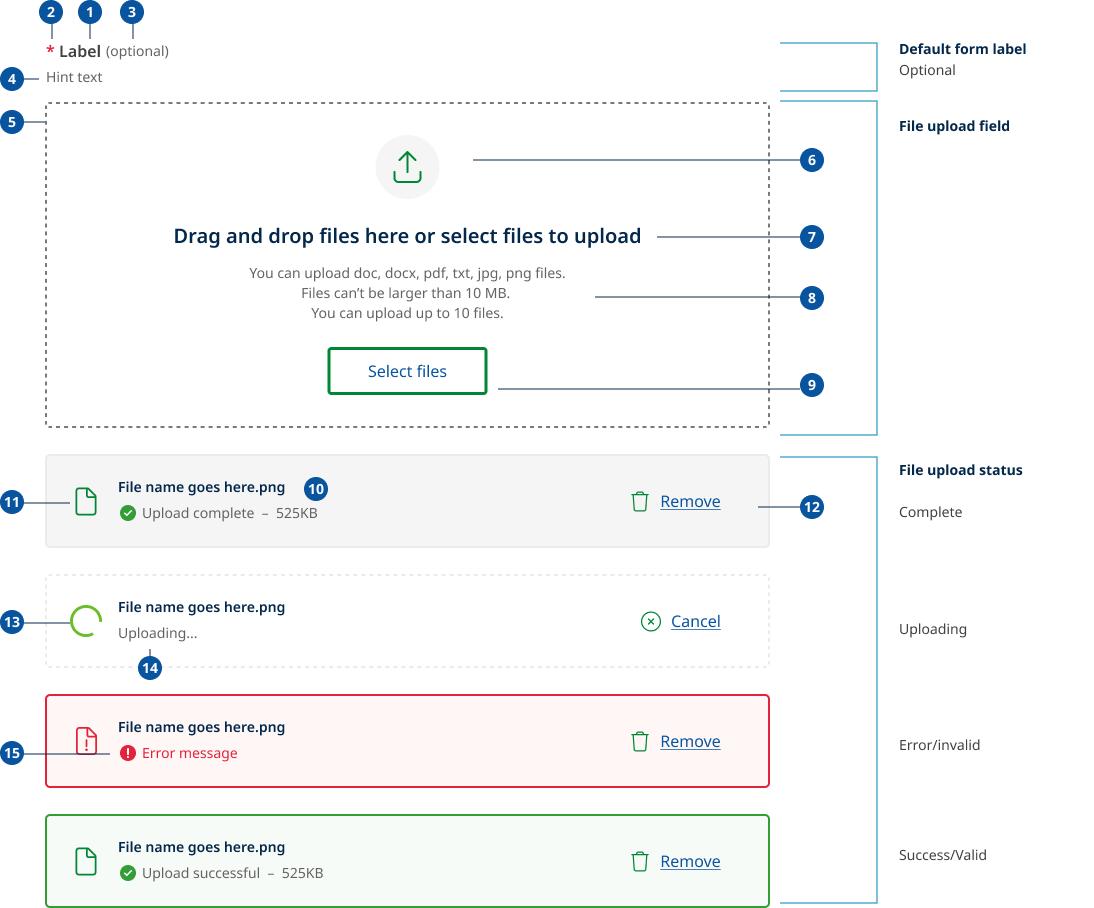
- Label: Labels are headings that identify the purpose or context of the input field. For example, a label might say "First Name" to indicate that the user should enter their first name in the text field. Standard label alignment is left-aligned with the field underneath. Labels are mandatory on all fields with some exceptions such as search fields used in the header.
- Required field indicators: To indicate that a field is required, display an asterisk (*) next to the label text and mention at the start of the form that asterisks indicate required fields.
- Optional field indicators: Optional field indicators indicate that a field is optional. Clearly indicate optional fields by displaying the word ‘optional’ in parentheses next to the label text.
- Hint/Helper text: Helper text conveys additional guidance about the input field, such as how it will be used. It should only take up a single line and be persistently visible.
- Drag and drop region: Allows users to interact with the file upload component by dragging items (such as files, images, or text) from one location and dropping them onto the input field. Dragging your mouse anywhere within the bounds of the drop zone (dotted area) with an attached file will enable you to drop it inside of the area and begin to upload.
- Trailing icons: This is the icon this is most commonly used to indicate an upload action. It only appears on desktop where the upload field is intentionally larger to facilitate easier drag and drop actions.
- Upload heading: This text to describes the two ways a user can interact with the upload files component. On mobile ‘drag and drop files here’ is removed.
- File upload description: Descriptions help communicate to the user what file size or format limitations there are. Each limitation should be written on a new line. The three most common are, accepted file formats, maximum size and number of files you can upload. This text should be written in plain language and follow the example within the component with each requirement on a new line.
- Select files button: “Select files” is the default text that appears with the file upload button. By click this button a user can browse their system for files to upload.
- Uploaded file title: The name of the file that has been uploaded including file type.
- File type icon: This icon indicates the type of file that has been uploaded, the region is also used for the loading spinner and file error icon.
- File actions: There are a number of actions available to users once they have selected a file for upload.
- During the upload they can ‘cancel’ the process.
- After the upload is complete they can ‘Remove’ the file.
- If there error or glitch during upload they can ‘retry’ to upload the file.
- If the file is invalid they can ‘remove’ the file.
- Loading spinner: The spinner, is a visual element used in user interfaces to indicate that content is being loaded or processed. It is replaced by the file type icon once the file is uploaded.
- File Status information: This area indicates the status of file and when complete also the total file size.
- Validation messages: When a file is either valid or invalid ot displays the relevant message and is accompanied by the same icons used in standard form fields.
Research and rationale
This design is based on patterns developed by the myQLD project and existing examples from the Agriculture and NSW design system.
The design tries to maintain visual consistency with the existing Qld government designs, it has only been updated to align more closely to the existing form components and to incorporate best practice as found through a comparative review of other design systems.
The myQLD pattern currently has a more advanced version of the loading state component, which while desirable was deemed out of scope for our initial implementation as it required further research, validation and development as seperate component.
Changes from the existing design where:
- Added more form upload field states including (invalid, disabled and focus)
- Dark variants added
- Simpler and more consistent responsive design
- Primary icon updated to one more commonly used for upload
- Dotted lines now only used for drag and drop and loading
- Valid and invalid file upload states where made more consistent with existing form field designs
- Existing SWE loading spinner used as an alternative to progress bar as simpler to implement and validate for MVP.
Label for file upload instructions
There was a wide variety of different different design systems communicated the instructions on how to interact with the file upload component. It was important to our team that the language used appropriately communicated the 2 ways to upload – via drag and drop or file selection via search.
We did a comparative review of 11 different examples of the text used to describe how interact with the component. Agricultures designs systems solution "Drag and drop files here or select files to upload" was deemed the best solution and most aligned to web writing guidlines.
Select vs browse
In our review of other design systems we found that there were two primary approaches for the label of the button within the component. The majority used either select files or browse.
We chose to use Select over browse because:
- ‘Select’ is more action-oriented and straightforward.
- It implies that users are choosing or picking files from their device.
- This option may be preferable if we want to emphasise the user's active role in the process, more direct and aligned to the task they need to complete.
- They know the file they want.
‘Browse’ is a bit more descriptive but not as direct. It suggests that users will be exploring or navigating their file system to find the desired files. This option is more preferable if you want to convey a sense of exploration or showcase options. Ie Browse events.
Error messages
When a specific file cannot be uploaded successfully it will show an error state. Our error messages were developed from the work done on the myQLD project and guidance provided with the uk.gov design system.
Below is list of errors type and examples of how the messages should be styled.
- If the file is the wrong file type
Say ‘The selected file must be a [list of file types]’. For example, ‘The selected file must be a CSV or ODS’ or ‘The selected file must be a JPG, BMP, PNG, TIF or PDF’. - If the file is too big
Say ‘The selected file must be smaller than [largest file size]’. For example, ‘The selected file must be smaller than 2MB’. - If the file is empty
Say ‘The selected file is empty’. - If the file contains a virus
Say ‘The selected file contains a virus’. - If the file is password protected
Say ‘The selected file is password protected’. - If there was a problem and the file was not uploaded
Say ‘The selected file could not be uploaded – try again’. - If there is a limit on how many files the user can select
Say ‘You can only select up to [highest number] files at the same time’. For example, ‘You can only select up to 10 files at the same time’. - If duplicate file name detected
Say 'Filename already in use. Please rename file before trying again.' - File has illegal charactersSay ‘Unsupported characters in file name. Only use letters, numbers, space, and special characters -_(’
Classes
Upload field
| Name | Description |
|---|---|
qld__form-group--file-upload Copy | This is a modifier class for qld__form-group, specifically tailored for styling the file upload component. |
qld__form-file-wrapperCopy | This class is applied to the container for both the input mechanism and any additional instructions or UI elements related to file uploading. |
qld__accordion-group qld__form-file-wrapper--dark | This class is a modifier to be used when creating dark variants of the file upload. |
qld__form-file-dropzoneCopy | This class is used for the area where users can drag and drop files for uploading. It include styles for border, background, and hover effects to indicate that it is an interactive dropzone. |
qld__form-file-dropzone--disabledCopy | This is a modifier class for the qld__form-file-dropzone it applies the disabled style. |
qld__form-file-dropzone--dragged-overCopy | This is a modifier class for the qld__form-file-dropzone it applies the hover style when files are dragged into the drop zone. |
qld__form-file-dropzone--updatingCopy | This is a modifier class for the qld__form-file-dropzone it applies the disabled by updating style to the drop zone. |
qld__file-input-iconCopy | This class applies to the icon within the file input area and is used to style the size and also to hide the icon on mobile displays. |
qld__file-input-titleCopy | This class is used for the text instructions within the file upload area, guiding users to either drag and drop files or click to open a file selector. It styles the text for clarity and emphasis. |
qld__file-input-constraintsCopy | This class is applied the text styles to the text describing the limitations and constraints of the file upload (e.g., file types, size limits). |
qld__file-input | This class is assigned to the actual file input field. It's described as "visuallyhidden", because it has styles to make it invisible while still being functional and accessible (e.g., for screen readers). |
qld__form-file-preview | This class lis for the container that houses the area where previews of uploaded files are shown. |
File status
| Name | Description |
|---|---|
qld__form-fileCopy | This class styles the overall container that holds individual file upload-related elements. |
qld__form-file-info-wrapperCopyprovides styling and structure for the wrapper that groups together the visual representation of the file (like an icon) and its descriptive information (like the file name and status). | Provides styling and structure for the wrapper that groups together the visual file type icon and its descriptive information such as the file name and status. |
qld__form-file-loaderCopy | This class is used for the spinner icon that visually represents the file being uploaded. |
qld__form-file--completeCopy | This is modifier class applied to the qld__form-file that applies the upload complete state. |
qld__form-file--errorCopy | opy This is modifier class applied to the qld__form-file that applies the upload error state. |
qld__form-file--success | opy This is modifier class applied to the qld__form-file that applies the upload success state. |
qld__form-file--updating | opy This is modifier class applied to the qld__form-file that applies the loading state. |
qld__form-file-infoCopy | This class styles the file's descriptive information |
qld__form-file-info-nameCopy | Class that applies the text styles to the file name |
qld__form-file-actions | his class styles the container for actions that can be taken on the file, such as deleting it. |
qld__form-file-delete-btn | This class is for the delete button associated with the file. |
Setting up the upload constraints
Accepted files
Use the accept and date-file-types props to specify what file types are allowed to be uploaded.
<input type="file"                 accept=".docx,.doc,.pdf"
 data-file-types=".docx,.doc,.pdf"
>
Maximum file size
Use the data-max-size prop to set a maximum size for each file. This value is measured in megabytes (mb).
<input type="file" data-max-size="10" >
Number of allowed files
You can also set data-max-files to limit how many files can be selected. Selecting multiple files is also supported with File upload. Simply add multiple="true".
<input type="file" data-max-files="3" multiple="true">
Accessible loading spinner requirements
Keep these considerations in mind if you're modifying the Design System or creating a custom component.
WCAG guidelines
1.4.1 Use of Colour
Use icons alongside error messages so that colour alone isn't used as the only visual means of conveying information, indicating an action, prompting a response, or distinguishing a visual element (WCAG, 2018).
1.4.3 Contrast (Minimum)
Border colours for the drag and drop region meet a 3:1 minimum colour contrast ratio to the background (WCAG, 2018).
1.3.1, 3.3.2: Indicate Required Fields
Clearly indicate required fields with an asterisk (*) or other visual indicators, and add the required attribute to the text input. Additionally, provide textual information, such as "(required)," for screen reader users (WCAG, 2018).
2.1.1 Keyboard
All functionality of the content, including the file upload drop zone, must be operable through a keyboard interface without requiring specific timings for individual keystrokes.
Users must be able to interact with the drag-and-drop functionality using a keyboard. Navigation to the upload area can be done using the Tab key, and activation (dropping files) should be possible with Enter or Space keys.
2.4.3 Focus Order
Ensure the navigation through components and controls on the web page is logical and intuitive. The sequence of focusing (tabbing) through elements should reflect the visual order and logical flow.
2.5.7 Dragging Movements
Do not use 'drag and drop' as the sole method for uploading files. Provide additional methods, such as a 'Choose file' button, to ensure the functionality is accessible to users who cannot use drag-and-drop due to mobility impairments.
3.3.1, 3.3.3: Implement Accessible Error Messages
If an input error is automatically detected, the item that is in error is identified and the error is described to the user in text. (Level A).
When displaying error messages, ensure they're clear, concise, and accessible to all users. Use the 'aria-describedby' attribute to associate error messages with the corresponding input field (Level AA) (WCAG, 2018).
3.3.2: Provide Clear Instructions
Ensure that any instructions or guidelines for filling out the text input are clear and easily understandable. This helps users avoid mistakes and better understand the expected input format. This is commonly seen in the form of hint text that appears below the labes.
4.1.2 Name, Role, Value
By building on the native HTML <input type="file"> element and enhancing it with additional interactive components like a visual <button>, the implementation needs to maintain accessible name, role, and value properties. These should be properly assigned so that assistive technologies can accurately communicate the controls to users. Ensuring that the button and the entire component are correctly labeled with ARIA attributes enhances the accessibility of the user interface.
Other useful accessibility guidance
Progressive Enhancement
Fallback Mechanisms: Design the file input component as a progressive enhancement of <input type="file" />. If advanced features fail to initialise, the component should still function and appear as a standard file input to ensure basic accessibility and functionality are maintained.
Make your uploaded file reusable if possible.
Make sure users can easily reuse a previously uploaded file within a single journey, unless doing so would be a major security or privacy concern. This is not mandatory but however it does make the experience better for users and comply with WCAG 2.2 success criterion 3.3.7 Redundant Entry.
References
Digital NSW (n.d.) File upload, NSW Design System, accessed 10 April 2023.
US Government (2022) File input , USWDS (US Web Design System), accessed 10 April 2023.
GOV.UK (n.d) File upload, GOV.UK Design System, accessed April 10, 2023.
IBM (n.d.) File uploader, IBM Carbon Design System, accessed March 7, 2023.
Sherwin K (2014) Progress Indicators Make a Slow System Less Insufferable, Nielsen Norman Group, accessed 12 April 2024.
Laubheimer, P. (2020) Drag–and–Drop: How to Design for Ease of Use, Nielsen Norman Group, accessed 15 April 2024.
DAFF (Department of Agriculture, Fisheries and Forestry) (2024) File upload, Agriculture Design System, Department of Agriculture, Water and the Environment, accessed 15 April 2024.
Ceara C (2022) Drag & Drop UX Design Best Practices, Pencil and Paper, accessed 15 April 2024.
Shopify (n.d.) Drop zone, Polaris, accessed 15 April 2024.
Siemens (2024) Dropzone, MindSphere Design System, accessed 15 April 2024.
Mesh (2024) File Upload, Mesh Design System, nib Group, accessed 15 April 2024.
Mehra A (2021) How to Design an Upload Media CTA The Right Way, Medium, accessed 15 April 2024.
OWASP (Open Worldwide Application Security Project) (2024) File Upload Cheat Sheet, OWASP Cheat Sheet Series, accessed 15 April 2024.
W3C (2024) Understanding Success Criterion 2.5.7: Dragging Movements, Web Content Accessibility Guidelines (WCAG) 2.2, World Wide Web Consortium, accessed 15 April 2024.
W3C (2018) Web Content Accessibility Guidelines (WCAG) 2.1World Wide Web Consortium, accessed March 7, 2023.
Related
Last updated: June 2024