Overview
Forms are an essential element within our Design System, serving as vital interactive components to gather user information and facilitate various digital tasks, including user registration, data entry, search queries, and settings configuration.
Key form elements in design systems typically include:
- Text fields: the most common elements, used to gather short, textual user inputs like names or email addresses
- Textarea: a multi-line text field for collecting longer form text input like comments or descriptions
- Radio buttons and Checkboxes: used for selecting one or many options from a list respectively
- Select boxes: useful for presenting multiple options in a constrained space
- Buttons: primarily used to submit the form
- Labels: provide descriptions to the corresponding input fields, enhancing usability and accessibility
- Helper or Hint text: additional descriptive text that guides users in filling out a form
- Validation Messages: provide immediate feedback to users, guiding them to complete the form correctly.
Labels
Labels help users understand what to enter into the field.
Label for a text input (‘Email’)
<p>Label for a text input (‘Email’)</p><br>

<label class="qld__label" for="email">Email</label>
<input type="email" class="qld__field-width--half qld__text-input qld__text-input--block" id="email" name="email" aria-describedby="email-hint"/>
Usage guidelines
All text inputs must have labels, and in most cases the label should be visible.
Write labels without a colon at the end. Otherwise, follow the normal rules for using punctuation marks.
Do
- Position labels above the text input they refer to.
- Keep labels short, direct and written in sentence case.
- Best practice suggest labels should be up to 5 words (MOD.UK, n.d).
Don't
- Use colons at the end of labels.
- Use all caps or the form will be harder to scan and read (Babich, 2020).
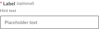
Hint text
Hint text can be helpful in forms to provide additional information or context to users as they fill out the form.
Help text for entering a tax file number
Tax file numbers are 9 digits
<p>Help text for entering a tax file number</p><br>

<label class="qld__label" for="TFN">What is your tax file number (TFN)?</label>
<span class="qld__hint-text" id="TFN-hint">Tax file numbers are 9 digits</span>
<input type="text" class="qld__field-width--md qld__text-input qld__text-input--block qld__text-input--number" id="TFN" inputmode="numeric" name="Tax file number" aria-describedby="TFN-hint"/>
Hint text
Hint text can be helpful in forms to provide additional information or context to users as they fill out the form.
Do
- Use hint text for additional information. Hint text can be used to provide additional information for form fields, such as providing examples of what could be entered in the field.
- Keep hint text short and clear. Hint text should be brief and to the point, so that users can quickly read and understand the information it provides.
- Only use helper text when truly necessary to avoid overloading the user (IMB, n.d).
Don't
- Don't use long paragraphs and lists in hint text. Screen readers read out the entire text when users interact with the form element. This could frustrate users if the text is long (UK.GOV, n.d.).
- Don't include links within hint text. While screen readers will read out the link text when describing the field, they won't tell users that the text is a link (UK.GOV, n.d.).
- Helper text shouldn't run longer than the input area (IMB, n.d).
Required and optional fields
You should indicate to users that a field is mandatory by placing a red asterisk at the beginning of the label.
When designing forms try to only ask for necessary information and where possible avoid optional fields. However, if you can’t avoid optional fields, indicate which fields are options by placing the word 'optional' in brackets after the label.
Required field
Hint text
Optional field
Hint text
<div class="row qld__row-gap-component">

<div class="co-xs-12 col-lg-4">
<p>Required field</p><br>

<!-- Example 1: Required field -->
<label for="required-field-example" class="qld__label">
    <!-- Required field indicator using aria-required attribute -->
    <abbr title="required">*</abbr>
    Text-field label
</label>
<span class="qld__hint-text" id="required-field-example-hint">Hint text</span>
<input type="text" id="required-field-example" class="qld__text-input qld__text-input--block" aria-required="true" aria-describedby="required-field-example-hint">
</div>


<div class="co-xs-12 col-lg-4">
<p>Optional field</p><br>

<!-- Example 2: Optional field -->
<label for="optional-field-example" class="qld__label">
    Text-field label
    <!-- Optional field indicator using aria-label attribute -->
    <span class="qld__label--optional"> (Optional)</span>
</label>
<span class="qld__hint-text" id="optional-field-example-hint">Hint text</span>
<input type="text" id="optional-field-example" class="qld__text-input qld__text-input--block" aria-describedby="optional-field-example-hint">
</div>

</div>
Usage guidelines
Place one of these 2 instructions at the top of your form depending on whether or not you have required or optional fields.
If you have both required and option fields use:
"All fields are required unless marked optional. Required fields are marked with an asterix (*)"
If you only have required fields use:
"All fields are required."
Using the right instruction will make it easier for people to fill in the form and ensure consistency with other forms on the site. Be aware that users often don't read instructions so ensure that you support these instructions by using the appropriate required or optional field indicator.
When to use require fields indicators
Even if most of the fields in your form are required you should still indicate to the user that a field is required. This convention helps users scan forms and increases the chance that your form will get completed correctly the first time (Budiu, 2019).
When to use optional fields indicators
Try to avoid using optional fields in your forms but if you do, always indicate to the user that the field is optional (Babich, 2020).
When not to use optional or required fields indicators
While it's best to incorporate optional and required fields whenever possible there are instances where it may not be necessary. These include forms that are limited to only one field and lLogin forms which are commonly composed of only two fields: the username and the password, both of which are always required (Budiu, 2019).
Validation states and messages
Success
Success messages are used to notify the user when a form field has passed validation. They provide positive reinforcement to the user, indicating that they've correctly filled out the field.
When text input is accepted, a message can display to the inform the user.
Success states are useful in situations like password generation where you can let the user know their password has met syntax requirements, or online tests to let the user know which answers where correct.
<div class="row qld__row-gap-component">

    <!-- Example: Success field -->
    <div class="co-xs-12 col-lg-4" >
       <label for="success-example-1" class="qld__label">Text-field label</label><span class="qld__hint-text" id="success-example-1-hint">Hint text</span>
       <span id="example-1-success-message" class="qld__input--success"> <svg class="qld__icon qld__icon--lead qld__icon--sm" role="img" aria-label="Success: ">
           <use href="./?a=151118#icon-Status-Success">
           </use>
         </svg>
        Success message</span>
       <input type="text" id="success-example-1" placeholder="placeholder text" class="qld__text-input qld__text-input--block qld__text-input--valid" aria-describedby="success-example-1-hint example-1-success-message">
    </div>

    <!-- Example: Success field filled style -->
    <div class="qld__form-style-filled co-xs-12 col-lg-4">
       <label for="success-example-2" class="qld__label">Text-field label</label><span class="qld__hint-text" id="success-example-2-hint">Hint text</span>
       <span id="example-2-success-message" class="qld__input--success"> <svg class="qld__icon qld__icon--lead qld__icon--sm" role="img" aria-label="Success: ">
           <use href="./?a=151118#icon-Status-Success">
           </use>
         </svg>
        Success message</span>
       <input type="text" id="success-example-2" placeholder="placeholder text" class="qld__text-input qld__text-input--block qld__text-input--valid" aria-describedby="success-example-2-hint example-2-success-message">
    </div>

 </div>
Errors
Error messages are used to notify the user when a form field hasn't passed validation. Use clear messages to explain what went wrong and how to fix it. For complex forms that have many fields and include hint text, you can choose to further emphasise invalid fields that contain errors by using the emphasised error state that contains a solid red line on the left, this red border visually connects the message and the question it belongs to.
Error field emphasised
<div class="row qld__row-gap-component">

<!-- Example: Error field -->
<div class="co-xs-12 col-lg-4">
    <label for="error-field-outlined-example" class="qld__label">Text-field label</label>
    <span id="error-field-outlined-example-message" class="qld__input--error"><svg class="qld__icon qld__icon--lead qld__icon--sm" role="img" aria-label="Error: ">
        <use href="./?a=151118#icon-Status-Error">
        </use>
      </svg>Error message</span>
    <input type="text" id="error-field-outlined-example" placeholder="placeholder text" class="qld__text-input qld__text-input--block qld__text-input--error" aria-describedby="error-field-outlined-error-message">
</div>


<!-- Example: Error field filled style -->
<div class="qld__form-style-filled co-xs-12 col-lg-4">
   <label for="error-field-filled-example" class="qld__label">Text-field label</label>
   <span id="error-field-filled-example-message" class="qld__input--error"><svg class="qld__icon qld__icon--lead qld__icon--sm" role="img" aria-label="Error: ">
       <use href="./?a=151118#icon-Status-Error">
       </use>
     </svg>Error message</span>
   <input type="text" id="error-field-filled-example" placeholder="placeholder text" class="qld__text-input qld__text-input--block qld__text-input--error" aria-describedby="error-field-filled-example-message">
</div>

</div>

<p>Error field emphasised</p>

<!-- Example: Error style emphasis -->
<div class="qld__form-group qld__form-style-filled qld__form-group--invalid co-xs-12 col-lg-4">

   <label for="error-field-emphasised-example" class="qld__label">Text-field label</label>
   <span class="qld__hint-text" id="error-field-emphasised-example-hint">Hint text</span>
   <span id="error-field-emphasised-example-message" class="qld__input--error"> <svg class="qld__icon qld__icon--lead qld__icon--sm" role="img" aria-label="Error: ">
       <use href="./?a=151118#icon-Status-Error">
       </use>
     </svg>Error message</span>
   <input type="text" id="error-field-emphasised-example" placeholder="placeholder text" class="qld__text-input qld__text-input--block qld__text-input--error" aria-describedby="error-field-emphasised-example-hint error-field-emphasised-example-message">
</div>
Usage guidelines
When to use error states and messages
Use error states and messages when users have made an error in their input. This helps to guide them towards the correct input and improves the overall user experience (Nielsen Norman Group, 2020).
When to use success states and messages
Success indicators can be used when users have correctly filled out complex fields. However, these should be used sparingly and only when they provide additional context that helps the user complete the form more accurately or quickly (Nielsen Norman Group, 2021).
When not to use
- Don't use validation messages to communicate issues that aren't related to the user's input. For example, if a user isn't eligible or doesn't have permission to do something, or if there's a lack of capacity or other problem with the service, this shouldn't be communicated through a validation message (GOV.UK, 2023).
- Validation messages shouldn't be used to communicate non-critical information. They should be reserved for important system-status messages that are meant to disrupt the user's workflow and draw attention to an issue that needs to be addressed (Nielsen Norman Group, 2020).
How to use
In order for validation messages to be effective, people need to see them, understand them, and be able to act upon them easily. (Nielsen Norman Group, 2021).
Do
- Display error or validation messages after the error has been made. Wait until a user moves on from a field to display an error message related to an appropriate format (Kaplan, 2022).
- Summarise the errors inside of a Page alert above the form.
- Make error messages easy to notice and understand (Nielsen Norman Group, 2021).
- Make error messages easy to memorise the instructions for fixing the error (Nielsen Norman Group, 2021).
- Be clear and concise: for error messages describe what has happened and tell them how to fix it. The message must be in plain English, use positive language and get to the point (GOV.UK, 2023).
- Use the same message next to the field and in the error summary so they look, sound and mean the same and make sense out of context. This reduces the cognitive effort needed to understand issue has occurred. (GOV.UK, 2023).
- Retain the users input after an unsuccessful form submission.
Don't
- Go overboard with success indicators. Success indicators shouldn’t distract users from filling out forms and should only be used when the additional context helps complete the form faster or more accurately (Nielsen Norman Group, 2021).
- Use technical jargon like ‘form post error’, ‘unspecified error’ and ‘error 0x0000000643’ (GOV.UK, 2023).
- Use words like ‘forbidden’, ‘illegal’, ‘you forgot’ and ‘prohibited’ (GOV.UK, 2023).
- Use ‘please’ because it implies a choice (GOV.UK, 2023).
- Use ‘sorry’ because it doesn't help fix the problem (GOV.UK, 2023).
- Use ‘valid’ and ‘invalid’ because they don't add anything to the message (GOV.UK, 2023).
- Use humorous, informal language like ‘oops’ (GOV.UK, 2023).
- Give an example in the error message if there's an example on the screen such as within the existing hint text (GOV.UK, 2023).
Be conscious if you notice repeated errors (3 or more times) occurring when testing your form, this may indicate a UI issue. Your error messages may not be clear enough, or the design might not meet users' needs. Remember, if users make mistakes, it's likely the design's fault.
Form groups
Used to group form controls and provide structure and consistent spacing within a form. The form group class defines the spacing between form elements. Spacing between from elements is 32px or 2rem.
<!--
   The qld__form-group class form group applies spacing between the following two elements
-->

<!-- Example 1: Required field -->
<div class="qld__form-group">
<label for="text-field-spacing-example-1" class="qld__label">
    <!-- Required field indicator using aria-required attribute -->
    <abbr title="required">*</abbr>
    First Name
</label>
<input type="text" id="text-field-spacing-example-1" class="qld__text-input qld__text-input--block qld__field-width--half" aria-required="true">
</div>

<!-- Example 2: Required field -->
<div class="qld__form-group">
   <label for="text-field-spacing-example-2" class="qld__label">
       <!-- Required field indicator using aria-required attribute -->
       <abbr title="required">*</abbr>
       Surname
   </label>
   <input type="text" id="text-field-spacing-example-2" class="qld__text-input qld__text-input--block qld__field-width--half" aria-required="true">
</div>
Fieldset
Fieldset is used to associate a number of related form fields as well as labels within a form. The legend provides an association and caption for the form fields in the fieldset.
For example, you may need to group a set of text inputs into a single fieldset when asking for an address.
<fieldset class="qld__fieldset">

   <legend class="qld__fieldset__legend">
       <h1 class="qld__display-lg">What is your address?</h1>
   </legend>

   <!-- Example 1: Required field -->
   <div class="qld__form-group">
      <label for="address-line1" class="qld__label">
         <!-- Required field indicator using aria-required attribute -->
         <abbr title="required">*</abbr>
         Address line 1
      </label>
      <input type="text" id="address-line1" name="address-line-1" class="qld__text-input qld__text-input--block qld__field-width--full" autocomplete="address-line1" aria-required="true">
      </div>

   <!-- Example 2: Optional field -->
   <div class="qld__form-group">
      <label for="address-line2" class="qld__label">
         Address line 2
         <!-- Optional field indicator using aria-label attribute -->
         <span class="qld__label--optional"> (Optional)</span>
      </label>
      <input type="text" id="address-line2" name="address-line-2" class="qld__text-input qld__text-input--block qld__field-width--full" autocomplete="address-line2">
   </div>

   <!-- Example 1: Required field -->
   <div class="qld__form-group">
      <label for="address-town" class="qld__label">
         <!-- Required field indicator using aria-required attribute -->
         <abbr title="required">*</abbr>
         Town or city
      </label>
      <input type="text" id="address-town" name="address-town" class="qld__text-input qld__text-input--block qld__field-width--half" aria-required="true">
   </div>

      <!-- Example 1: Required field -->
      <div class="qld__form-group">
         <label for="address-postcode" class="qld__label">
            <!-- Required field indicator using aria-required attribute -->
            <abbr title="required">*</abbr>
            Postcode
         </label>
         <input type="text" id="address-postcode" name="address-postcode" class="qld__text-input qld__text-input--block qld__field-width--1-quarter" autocomplete="postal-code" aria-required="true">
      </div>

</fieldset>
Usage guidelines
When to Use
- If your form has multiple related controls, such as a set of radio buttons or checkboxes, you should use
<fieldset>. The<legend>element can then be used to provide a caption or title for the group. - In complex forms with many inputs,
<fieldset>can be used to divide the form into logical sections. This can make the form easier to understand and navigate, particularly for screen reader users.
When not to use
- If your form only contains a single control (like a search box), there's no need to use
<fieldset>. A simple<label>and<input>would suffice. - If your form contains unrelated controls, it's not appropriate to group them together with
<fieldset>.
Form example
The HTML <form> element is used to create a HTML form for user input. The <form> element is a container for different types of input elements, such as text fields, checkboxes, radio buttons, submit buttons, etc. Below is a simple example of how you can structure a form using some of the form components above.
Simple form
Introductory paragraph providing context for this form.
<h2>Simple form</h2>
<p>Introductory paragraph providing context for this form.</p>
<hr class="qld__horizontal-rule--lg">
<form>

    <fieldset class="qld__fieldset">

        <legend class="qld__fieldset__legend">
            <h3 class="qld__display-md">Section heading</h3>
        </legend>

        <!-- Example 1: Related Required field -->
        <div class="qld__form-group">
            <label for="related-text-field-example-1" class="qld__label">
                <abbr title="required">*</abbr>
                Related text field heading
            </label>
            <span class="qld__hint-text" id="related-text-field-example-1-hint">Hint text</span>
            <input type="text" id="related-text-field-example-1" class="qld__text-input qld__text-input--block qld__field-width--half" aria-required="true" aria-describedby="related-text-field-example-1">
        </div>
        <!-- Example 2: Related Required field -->
        <div class="qld__form-group">
            <label for="related-text-field-example-2" class="qld__label">
                <abbr title="required">*</abbr>
                Related text field heading
            </label>
            <span class="qld__hint-text" id="related-text-field-example-2-hint">Hint text</span>
            <input type="text" id="related-text-field-example-2" class="qld__text-input qld__text-input--block qld__field-width--half" aria-required="true" aria-describedby="related-text-field-example-2-hint">
        </div>

    </fieldset>

    <hr class="qld__horizontal-rule--lg">

    <!-- Example 3: Isolated Optional field -->
    <div class="qld__form-group">
        <label for="isolated-text-field-example" class="qld__label">
            Stand alone field
            <!-- Optional field indicator using aria-label attribute -->
            <span class="qld__label--optional"> (Optional)</span>
        </label>
        <span class="qld__hint-text" id="isolated-text-field-example-hint">Hint text</span>
        <input type="text" id="isolated-text-field-example" class="qld__text-input qld__text-input--block qld__field-width--half" aria-describedby="isolated-text-field-example-hint">
    </div>

    <hr class="qld__horizontal-rule--lg">
    <!-- Submit button -->
    <div>
        <input type="submit" class="qld__btn" name="submit" value="submit">
    </div>
</form>
General usage guidelines
Below are general guidelines for forms. It's also recommended that you review the Australian Government Style Manual for more detailed advice on form content.
When to use forms
Forms are used to capture data from users.
You might design a form for a user to:
- create and account or login
- register for a service
- configure settings
- fill in a survey and provide feedback
- purchase a product
- search for something.
When Not to Use Forms:
Don't use forms if the user is performing a simple action that doesn't require additional information, such as liking a post or downloading a file. A simple button or link will work better in these instances.
Don't use forms to display information. Forms are for collecting input, not displaying output. If you're simply displaying information to the user, use other UI elements like text, images, tables, or lists.
How to use forms
Do
- Try to keep forms to one column, multiple columns easily disrupt a user’s vertical momentum (Digital NSW, 2022).
- Use the right sized text inputs. Make sure the text boxes match the expected content size for what they need to write. This will help convey to them that what they're inputting is correct (UK.GOV n.d.)
- Group Related Fields. If your form has many fields, group related fields together using subheadings or fieldset elements to make the form easier to navigate and understand.
Don't
- Mix the outlined style and filled style of a text field in the same form.
- Use all caps for labels, validation messages or hint text.
- Disable copy and paste. Users often need to copy and paste information into a text input, so don't stop them from doing this (UK.GOV n.d).
- Ask for Unnecessary Information. Only include fields that are absolutely necessary. Each additional field increases the effort required to fill out the form and can deter users.
Other best practice
Number of text fields per page
When it comes to designing forms, and using text input components a good rule of thumb is that shorter is better, less effort on the part of the user will lead to higher completion rates.
Try to always limit the number of text fields as much as possible. Overall this will make your forms feel less bloated, especially when you’re requesting a lot of information. Displaying only 5 to 7 input fields at a given time is a common practice (Babich, 2020).
Background colours
It's recommended where possible to use white backgrounds for long forms. White backgrounds provide a clean, uncluttered canvas for forms, making them easier to read and fill out. This can help reduce user frustration and increase completion rates.
Avoid placeholder text
Research completed by GOV.UK (n.d.) and research from Nielsen and Norman group (2018) suggests that you shouldn't use placeholder text in place of a label, or for hints or examples, as:
- it vanishes when the user starts typing, which can cause problems for users with memory conditions or when reviewing answers
- not all screen readers read it out
- its browser default styles often don't meet minimum contrast requirements.
The only time that you may need placeholder text is to indicate unconventional formatting that a user may be unfamiliar with. Placeholder text provides hints or examples of what to enter (e.g. YYYY-MM-DD). However, since placeholder text disappears once the user begins to input data, it should never contain crucial information.
Multiple Design Systems in our comparative analysis recommend that alternatives such as tool tips be used to convey this information.
Numbers
If you’re asking the user to enter a whole number, set the inputmode attribute to numeric to use the numeric keypad on devices with on-screen keyboards (UK.GOV, n.d).
Don't use <input type="number"> unless your user research shows that there’s a need for it. With <input type="number"> there’s a risk of users accidentally incrementing a number when they’re trying to do something else - for example, scroll up or down the page (UK.GOV, n.d).
Input field anatomy
The anatomy of input fields in our design system consists of several elements:
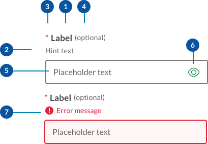
- Labels: Labels are headings that identify the purpose or context of the input field. For example, a label might say "First Name" to indicate that the user should enter their first name in the text field. Standard label alignment is left-aligned with the field underneath. Labels are mandatory on all fields with some exceptions such as search fields used in the header.
- Hint/Helper text: Helper text conveys additional guidance about the input field, such as how it will be used. It should only take up a single line and be persistently visible.
- Required field indicators: To indicate that a field is required, display an asterisk (*) next to the label text and mention at the start of the form that asterisks indicate required fields.
- Optional field indicators: Optional field indicators indicate that a field is optional. Clearly indicate optional fields by displaying the word ‘optional’ in parentheses next to the label text.
- Placeholder text: Hints at what goes into a field. Placeholder text is optional. It should always be avoided unless communicating complex formatting requirements.
- Trailing icons: Trailing icons are optional, they're often used to convey additional field functionality or options. This space should also be reserved to fit icons that some browsers might insert into the input (for example to show or generate a password) (UK.GOV n.d).
- Validation messages
- Error messages: When text input isn't accepted, an error message can display instructions on how to fix it. Error messages are displayed above the input line.
- Success messages: When text input is accepted, a message can display to the inform the user. This is useful in situations like password generation where you can let the user know their password has met syntax requirements.
Visual style
Within our Design System we have 2 styles of input fields, outlined and filled.
Outlined text fields
Outlined text fields have more visual emphasis than filled text fields, making them stand out when surrounded by other content or components.
Filled text fields
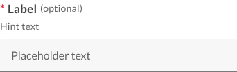
Filled text fields have less visual emphasis than outlined text fields. They work best where there are many text fields that are placed together to reduce the visual weight of complex forms.
Input field sizes
Use the width of a text input field to suggest the length of information it should contain. It provides a visual guide for users. For instance, a postcode input field should be narrower than an email field.
By default, the width of text inputs is fluid and will fit the full width of the container they're placed into. If you want to make the input smaller, you can either use a fixed width input, or use the width override classes to create a smaller, fluid width input.
Fluid width
There are 4 fluid widths for text-boxes.
<!--
  Full:  <input class="qld__text-input--block">
  3/4:   <input class="au-text-input qld__field-width--3-quarters">
  Hlaf:  <input class="au-text-input qld__field-width--half">
  1/4:   <input class="au-text-input au-text-input--width-lg">

-->
    <!-- Full -->
    <div class="qld__form-group">
        <label for="text-field-id-1" class="qld__label">
            <abbr title="required">*</abbr>
            Text-field label
        </label>
        <span class="qld__hint-text" id="text-field-hint-1">Hint text</span>
        <input type="text" id="text-field-id-1"
            class="qld__text-input qld__text-input--block" aria-required="true"
            aria-describedby="text-field-hint-1">
    </div>
    <!-- 3 Quarters -->
    <div class="qld__form-group">
        <label for="text-field-id-2" class="qld__label">
            <abbr title="required">*</abbr>
            Text-field label
        </label>
        <span class="qld__hint-text" id="text-field-hint-2">Hint text</span>
        <input type="text" id="text-field-id-1"
            class="qld__text-input qld__text-input--block qld__field-width--3-quarters" aria-required="true"
            aria-describedby="text-field-hint-2">
    </div>
    <!--Half -->
    <div class="qld__form-group">
        <label for="text-field-id-3" class="qld__label">
            <abbr title="required">*</abbr>
            Text-field label
        </label>
        <span class="qld__hint-text" id="text-field-hint-3">Hint text</span>
        <input type="text" id="text-field-id-3"
            class="qld__text-input qld__text-input--block qld__field-width--half" aria-required="true"
            aria-describedby="text-field-hint-3">
    </div>
    <!-- 1 Quarter -->
    <div class="qld__form-group">
        <label for="text-field-id-4" class="qld__label">
            <abbr title="required">*</abbr>
            Text-field label
        </label>
        <span class="qld__hint-text" id="text-field-hint-4">Hint text</span>
        <input type="text" id="text-field-id-4"
            class="qld__text-input qld__text-input--block qld__field-width--1-quarter" aria-required="true"
            aria-describedby="text-field-hint-4">
    </div>
Fixed width
There are 6 preset widths for text-boxes based on character numbers. Use fixed width inputs for content that has a specific, known length. Postcode inputs should be postcode-sized, telephone number inputs should be telephone number-sized.
Width is determined by the widest character which in most cases is capital ‘W’.
<!--
20 Characters:  <input class="qld__text-input--block qld__field-width--20char">
10 Characters:  <input class="au-text-input qld__field-width--10char">
5 Characters:   <input class="au-text-input qld__field-width--5charf">
4 Characters:   <input class="au-text-input qld__field-width--4char">
3 Characters:   <input class="au-text-input qld__field-width--3char">
2 Characters:   <input class="au-text-input qld__field-width--2char">
-->
    <!-- 20 Characters -->
    <div class="qld__form-group">
        <label for="text-field-id-1" class="qld__label">
            <abbr title="required">*</abbr>
            Text-field label
        </label>
        <span class="qld__hint-text" id="text-field-hint-1">Hint text</span>
        <input type="text" id="text-field-id-1"
            class="qld__text-input qld__text-input--block qld__field-width--20char" aria-required="true"
            aria-describedby="text-field-hint-1">
    </div>
    <!-- 10 Characters -->
    <div class="qld__form-group">
        <label for="text-field-id-2" class="qld__label">
            <abbr title="required">*</abbr>
            Text-field label
        </label>
        <span class="qld__hint-text" id="text-field-hint-2">Hint text</span>
        <input type="text" id="text-field-id-1"
            class="qld__text-input qld__text-input--block qld__field-width--10char" aria-required="true"
            aria-describedby="text-field-hint-2">
    </div>
     <!-- 5 Characters -->
    <div class="qld__form-group">
        <label for="text-field-id-3" class="qld__label">
            <abbr title="required">*</abbr>
            Text-field label
        </label>
        <span class="qld__hint-text" id="text-field-hint-3">Hint text</span>
        <input type="text" id="text-field-id-3"
            class="qld__text-input qld__text-input--block qld__field-width--5char" aria-required="true"
            aria-describedby="text-field-hint-3">
    </div>
    <!-- 4 Characters -->
    <div class="qld__form-group">
        <label for="text-field-id-4" class="qld__label">
            <abbr title="required">*</abbr>
            Text-field label
        </label>
        <span class="qld__hint-text" id="text-field-hint-4">Hint text</span>
        <input type="text" id="text-field-id-4"
            class="qld__text-input qld__text-input--block qld__field-width--4char" aria-required="true"
            aria-describedby="text-field-hint-4">
    </div>
     <!-- 3 Characters -->
       <div class="qld__form-group">
        <label for="text-field-id-5" class="qld__label">
            <abbr title="required">*</abbr>
            Text-field label
        </label>
        <span class="qld__hint-text" id="text-field-hint-4">Hint text</span>
        <input type="text" id="text-field-id-5"
            class="qld__text-input qld__text-input--block qld__field-width--3char" aria-required="true"
            aria-describedby="text-field-hint-5">
    </div>
    <!-- 2 Characters -->
       <div class="qld__form-group">
        <label for="text-field-id-6" class="qld__label">
            <abbr title="required">*</abbr>
            Text-field label
        </label>
        <span class="qld__hint-text" id="text-field-hint-6">Hint text</span>
        <input type="text" id="text-field-id-6"
            class="qld__text-input qld__text-input--block qld__field-width--2char" aria-required="true"
            aria-describedby="text-field-hint-6">
    </div>
Research and rationale
Like most of our components input fields started off using the DTA designs as a base. As our Design System progressed, we saw a need to include additional styles with less visual weight as well as to investigate this pattern as a whole to understand why other Designs Systems had diverged from the original DTA patterns.
To inform our design choices we collated best practice research from a number of sources such as the Nielsen and Normans group articles, industry leaders, guidelines from Google's Material Design and the UK.GOV’s Design System and the IBM carbon Design System and experts such as author of Form design patterns book Adam Silver whose work focuses on highly accessible form patterns and the original sited research used by the DTA.
We also conducted a comparative review of forms patterns, looking at widths, heights, layout and features used by:
Borders
Based on research and advice from a third party accessibility audit of our components we chose to continue to use thick borders for our input boxes as seen in the DTA, borders must use the secondary-alt border colour which is crafted to meet a 3:1 minimum colour contrast ratio, W3C guidelines. Graphical objects that are very thin are harder to perceive, therefore have a higher contrast requirement of 4.5:1. Graphical objects that are thicker or are solid shapes have a lower requirement of 3:1. 1px is considered thin and 3px is considered thick. Because our forms are using 2px borders we opted to ensure our contrast ration actually closer to 4.5.
Outlined and filled styles
Some of the feedback we received on the current form component was that the thick and dark border styles often looked out of place with the rest of the page or when a form element was in an isolated location. We noticed that most other Design Systems reduced the border thickness to-compensate for this. As we didn't want to compromise the accessibility of our forms, we looked to our comparative analysis of forms patterns to see if there was an alternative approach to resolve this problem.
Our solution came from IBM Carbon, Microsoft Fluent and Google’s Material Design all of which employ a secondary form style called ‘Filled’. This style uses only a solid border at the base of the form and then different background colour shade for the fill. Within our Design System having only the 2px solid border at the base can soften the overall visual weight of the form field as well as give the form design a more modern aesthetic.
Both types of text fields use a container to provide a clear affordance for interaction, making the fields discoverable in layouts.
Size
During our review of Design Systems, we determined that the average size for a form field was between 32px and 48px high. This aligns with Apples Apple's Human Interface Guidelines and Google's Material Design Guidelines that recommend touch points should be at least 44px, Adam Silver also reinforces this with his recommendations that 44px height or more is good to ensure they're easy to tap (Silver, 2019).
In our Design System we chose to follow the NSW input components which used a height of 48px as this worked nicely with our underlying grid pattern and allowed for generous white spacing.
Colour
They often still work on light alternative and dark alternative backgrounds but care should be taken to check and ensure there are not contrast issues. It is recommended where possible to use only light or dark backgrounds for long forms for best performance.
Behaviour
One of the elements that was missing from the DTA’s form components that we discovered in our comparative review was the inclusion of a hover state for form elements. We chose to include this as an additional indicator to users that the form field is a clickable element, this was also consistent with Google Material Design’s (n.d) approach to text field behavior. In our component the hover state changes the border to colour to use the ‘Primary action colour’ which we have established with our Design System as an indicator of an interactive element.
When testing form behaviour, we also discovered that it made sense to use a consistent focus state for both the filled and outlined style of forms. The focus state which includes a 3px outline that surrounds the form element and a white background colour ensures optimum contrast for the user when they're inputting text. Making this state standout also aligns with Material Design guidance on focus states, suggesting that they should be highly emphasised and signified by an overlay, colour change.
Creating consistency wherever possible is part of our design principles and keeping focus states the same across all input fields aligns with this. Our belief is that it will help users recognise they're interacting with a form element no matter what its starting visual appearance is. This will be useful if a designer has used outlined and filled styles for different forms across the same website.
Hint messages
According to Material Design (n.d) best practice for hint messages is that they should only take up a single line and be persistently visible or visible only on focus. Our comparative review suggested hint text was commonly placed above and below the input field. During out testing though we discovered that browser auto-complete suggests would often cover the field if placed below. For this reason, we opted to follow the existing DTA convention of placing it between the label and input field, this is also what is recommend by the UK Government Design system (n.d) and Adam Silvers article on form design layouts (Silver, 2019).
Labels
Research informing guidelines for forms (Bargas-Avila et al. 2009) points to the best positioning for labels is to be above the text field as this results in a number of advantages:
- label length doesn't affect form field placement
- faster completion rates
- reduces the number of fixations (easier to scan).
The only adjustments we made from the original DTA source however was to increase the font-weight of these labels, enabling them to stand out better on the page which was in line with best practice of other Design Systems.
Required fields and optional fields
Research informing guidelines for forms (Bargas-Avila et al. 2009) and our own comparative review of common practices indicated that a red asterix was the best choice indicator to mark required fields. Using colour to highlight required fields was shown to lead to faster completion rates Pauwels et al. (2009).
The placement of the asterix in our Design System is at the beginning of the label, as it can draw attention to the field and make it easier to locate required fields when scanning multiple fields with labels of varying length.
For optional fields we chose to follow IBM Carbon (2023) convention of writing the word optional after the label.
Validation messages
Error and validation messages are positioned above the text field. This is because placing error messages under fields is problematic. Adrian Roselli (2017) author several books on web design offers the following simple arguments in his article on message positioning for why:
- auto-complete features in browsers obscure them
- on-screen keyboards can obscure them
- depending on how you programmatically associate this text with form fields, it may be an anti-pattern to announce afterward in screen readers.
We've also chosen to adopt Nielsen and Norman group's recommendations (Krause, 2019) that colour is used to help validations states stand out and that a transparent background shade of the same colour be added to the error field to make it salient on a page that includes many fields.
Validation Iconography
In our comparative review we found that icons were commonly included with error and validation messages. We chose to follow this convention and include icons in a validation messages. The incorporation of icons was also supported by Nielsen and Norman Group’s article on website form usability which states that Errors should be signaled through a variety of cues, not solely through colour and WCAG Level A requirements which state colour isn't used as the only means of conveying information. The article how to report errors (Krause, 2019) states that together with colour, using icons to the left of your error message will draw attention to the error and help users that are colour blind.
Planned improvements and research
There are a number of proposed features based on common functionality we noted in our comparative review that we intend to review as improvements to this component.
These include:
- use of tool tips in forms to replace placeholder text or provide additional context
- prefix and suffixes to help users enter things like currencies and measurements
- use of the Character Countdown component to inform users of how many characters they have left while typing in text fields
- autocomplete styling
- trailing icons such as show and hide options for password fields.
Classes
| Name | Description |
|---|---|
qld__form-style-filled | Sets the form field style to use the filled variant. This must be applied to the enclosing div or form element. |
| This is applied to the <label> element applies the label styles for input fields. |
| Applied to a <span> element below the label this styles the hint text for the form field. |
| This styles the word "(optional)" when used in optional fields. Optional text must be placed directly after the label in a <span> element and before any hint text. |
| This is the class styles required for the field indicator which is an asterisk. <abbr title="required">*</abbr> |
| This class is required for all input 'text' fields and 'textarea' fields. It applies the default styles for these fields. |
qld__select | This class is required for all 'Select' fields. It applies the default styles for these fields. |
qld__control-input__input | This class is required for all 'Radio' and 'Checkbox' fields. It applies the default styles for these fields. |
qld__control-input__text | This class styles the text that sits alongside checkboxes and radio buttons. |
| This should be applied to most form fields. It sets the display style to block and applies the default responsive behaviour. |
qld__select-input--block | This should be applied to most form fields. It sets the display style to block and applies the default responsive behaviour. |
qld__control-input--block | This should be applied to most form fields. It sets the display style to block and applies the default responsive behaviour. |
qld__text-input--number | This is a utility class can be used to apply tabular numbers to input fields that contain only numerals. |
qld__input--error | This styles the error messages on form fields. |
qld__input--success | This styles the success messages on form fields. |
qld__text-input--error | This styles the error state on a form fields. |
qld__text-input--valid | This styles the valid/success state on a form fields. |
qld__form-group | This adds space between form elements when applied to a container div. |
qld__fieldset | Class applied to the <fieldset> element which is used to group related form fields. |
qld__fieldset__legend | This class applies default style for the <legend> element. This element provides a caption or a title for the fieldset, describing the purpose or meaning of the form elements within it. |
qld__field-width--1-quarter | Utility class applied to the form field that set the width to 1 quarter of the container. |
qld__field-width--half | Utility class applied to the form field that set the width to half the container. |
qld__field-width--3-quarters | Utility class applied to the form field that set the width to 3 quarters of the container. |
qld__field-width--20char | Utility class applied to the form field that set the width to approximately 20 characters. |
qld__field-width--10char | Utility class applied to the form field that set the width to approximately 10 characters. |
qld__field-width--5char | Utility class applied to the form field that set the width to approximately 5 characters. |
qld__field-width--4cha | Utility class applied to the form field that set the width to approximately 4 characters. |
qld__field-width--3char | Utility class applied to the form field that set the width to approximately 3 characters. |
qld__field-width--2cha | Utility class applied to the form field that set the width to approximately 2 characters. |
Variables
| Name | Description |
|---|---|
$QLD-color-error | Colour for warning elements. This is a global system colour. |
$QLD-color-error__light | Colour for warning elements backgrounds. |
$QLD-color-error__shade | Darker shade for warning elements backgrounds and hover states. |
$QLD-color-success__shade | Colour for success elements. This is a global system colour. |
$QLD__alert-success--shade-light | Colour for success elements backgrounds. |
$QLD__alert-success--shade-dark | Darker shade for success elements backgrounds and hover states. |
$QLD-fixed-width__char-2 | Defines the size for 2 characters. |
$QLD-fixed-width__char-3 | Defines the size for 3 characters. |
$QLD-fixed-width__char-4 | Defines the size for 4 characters. |
$QLD-fixed-width__char-5 | Defines the size for 5 characters. |
$QLD-fixed-width__char-10 | Defines the size for 10 characters. |
$QLD-fixed-width__char-20 | Defines the size for 20 characters. |
$QLD-fluid-width__full | Defines % for full width. |
$QLD-fluid-width__3-quarters | Defines % for 3/4 width (This may occasionally need to be adjusted to factor in column gaps and padding). |
$QLD-fluid-width__half | Defines % for 1/2 width (This may occasionally need to be adjusted to factor in column gaps and padding). |
$QLD-fluid-width__1-quarter | Defines % for 31/4 width (This may occasionally need to be adjusted to factor in column gaps and padding). |
Accessible form requirements
Keep these considerations in mind if you're designing forms.
General guidelines
Never disable a submit button, even if all of the required fields aren't filled in. Instead, describe what needs to be done using validation and error messages (Atlassian, n.d).
For text fields with interactive trailing icons, the accessibility label should clarify its function (Google, n.d).
If you have multiple inputs for a field, don’t auto tab between them. It causes users to make mistakes (Silver, 2019).
Use 'autocapitalize="none"', 'autocorrect="off"' and 'spellcheck="false"' to stop browsers automatically changing user input on fields that expect grammatically incorrect data—like email addresses and passwords (Silver, 2019).<input type="email" autocapitalize="none" autocorrect="off" spellcheck="false">
Use the <fieldset> and <legend> elements to group and associate related form controls (W3C,2019a).
Divide long forms into multiple smaller forms that constitute a series of logical steps or stages and inform users about their progress (W3C,2019a).
WCAG guidelines
Below details some of the guidelines for forms see the WCAG website for a more detailed accessibility guidance for each specific form element.
1.3.5: Identify input purpose
This a Level AA criterion that aims to make web content more accessible for people with disabilities by enabling user agents and assistive technologies to understand the purpose of input fields, like select boxes, collecting user information.
To comply with this guideline, you need to ensure that:
- the input field serves a purpose listed in the 'Input Purposes for User Interface Components' section of the WCAG 2.1 specification
- the content is created using web technologies that support identifying the expected meaning of the input field.
Some browsers attempt to aid the user by automatically filling form controls rather than having the user reenter their information each time. For example, a field asking for the user's telephone number can be automatically filled with the user's phone number.
1.3.1, 4.1.2: Use appropriate input types
Use the correct input type for the specific purpose of the text input, such as email, tel, password, or number. This helps with accessibility and provides appropriate input controls for different devices (WCAG, 2018).
1.4.1 Use of Colour
Use icons alongside error messages so that colour alone isn't used as the only visual means of conveying information, indicating an action, prompting a response, or distinguishing a visual element (WCAG, 2018).
1.4.3 Contrast (Minimum)
All border colours should be accessible and meet a 3:1 minimum colour contrast ratio to the background (WCAG, 2018).
2.1.1: Keyboard accessibility
Ensure that users can interact with the text input using keyboard controls. By default, text inputs should be accessible with the Tab key to focus and the Enter or Space keys to submit the form (if applicable) (WCAG, 2018).
1.3.1, 3.3.2: Indicate Required Fields
Clearly indicate required fields with an asterisk (*) or other visual indicators, and add the required attribute to the text input. Additionally, provide textual information, such as "(required)," for screen reader users (WCAG, 2018).
3.3.1, 3.3.3: Implement Accessible Error Messages
If an input error is automatically detected, the item that is in error is identified and the error is described to the user in text. (Level A).
When displaying error messages, ensure they're clear, concise, and accessible to all users. Use the 'aria-describedby' attribute to associate error messages with the corresponding input field (Level AA) (WCAG, 2018).
3.3.4 Error Prevention (Legal, Financial, Data)
For web pages that cause legal commitments or financial transactions for the user to occur, that modify or delete user-controllable data in data storage systems, or that submit user test responses, at least one of the following is true: Reversible, Checked, Confirmed (Level AA) (WCAG, 2018).
3.3.2: Provide Clear Instructions
Ensure that any instructions or guidelines for filling out the text input are clear and easily understandable. This helps users avoid mistakes and better understand the expected input format. This is commonly seen in the form of hint text that appears below the labe (W3C 2019b).
References
IBM (n.d. a) Forms: Optional vs. Required Fields IBM Carbon Design System, accessed March 7, 2023.
IBM (n.d b) Text input, IBM Carbon Design System, accessed March 7, 2023.
MOD.UK (n.d.) Forms, MOD.UK Design System, Ministry of Defence, accessed March 7, 2023.
GOV.UK (n.d a) Text input, GOV.UK Design System, accessed March 9, 2023.
GOV.UK (n.d b) Error message, GOV.UK Design System, accessed 30 July 2023.
Roselli A (2022) Avoid messages under fields, accessed March 9, 2023.
Google (n.d) Text fields, Material Design System 2, accessed March 7, 2023.
Whitenton K (2016) Website Forms Usability: Top 10 Recommendations, Neilson and Norman group, accessed March 7, 2023.
Babich N (2020) ‘Best Practices: Structure, Inputs & Labels’, Adobe XD Ideas, Adobe, accessed March 7, 2023.
Kaplan K (2022) Hostile Patterns in Error Messages, Nielsen Norman Group, accessed 30 July 2023.
Krause R (2019) How to Report Errors in Forms: 10 Design Guidelines, Nielsen Norman Group, accessed 30 July 2023.
Adobe (2022) Text-fields, Adobe Spectrum Design System, accessed March 7, 2023.
Atlassian (n.d) Form usage, Atlassian Design System, accessed March 7, 2023.
Silver A (n.d) Text box, No Style Design system, accessed 9 March 2023.
Silver A (2019) Form design from zero to hero all in one blog post, Adam Silver Website, accessed March 7, 2023.
W3C (2018) Web Content Accessibility Guidelines (WCAG) 2.1World Wide Web Consortium, accessed March 7, 2023.
W3C (2019a) Forms concepts, Web accessibility tutorials, World Wide Web Consortium, accessed March 7, 2023.
W3C (2019b) Form instructions, Web accessibility tutorials, World Wide Web Consortium, accessed March 7, 2023.
W3C (2019c) Understanding Success Criterion 1.4.11: Non-text Contrast,World Wide Web Consortium, accessed March 7, 2023.
W3C (2019d) Contrast (Minimum) - Low Vision Accessibility Task Force World Wide Web Consortium, accessed March 7, 2023.
Bargas-Avila JA, Brenzikofer O, Roth SP, Tuch AN, Orsini S and Opwis K (2011) 'Simple but Crucial User Interfaces in the World Wide Web: Introducing 20 Guidelines for Usable Web Form Design', Semantic Scholar, University of Basel, Faculty of Psychology, Department of Cognitive Psychology and Methodology, Switzerland.
Digital NSW (2022) Forms, Components, NSW Government Design System, accessed March 7, 2023.
Digital Transformation Agency (2018) Text-inputs, Gold Design System (Formerly DTA), accessed 10 April 2023.
Microsoft (2022) Forms Controls and patterns, Microsoft Fluent Design System, accessed March 7, 2023.
Birkett A (2019) Form design: 13 empirically backed best practices, accessed 30 April 2020.
Last updated: May 2024