Overview
The consistent alignment of elements is paramount for good UI design.
All spacing between interface elements should use the following predefined spacing options to help ensure consistency and speed up design and development time.
The following are the general principles that we used to calculate and define spacing across the design system:
- the base-unit of spacing in the design system is derived from 1rem which in most browsers equates to 16px
- spacing options are generally based on increments of 8px in order to align to an 8px grid
- fonts and line heights are always multiples of 4 to align to a baseline grid of 4px
- generally spacing is always applied as a margin top.
Vertical rhythm
Vertical rhythm is about establishing repetitive spacing and patterns that create a familiar and predictable experience across all pages of a site.
To create vertical rhythm, we use our 8px vertical grid system with a defined set of rules for spacing between, text areas, components, content sections and containers.
Base units
Base units are the fundamental measurements or building blocks used for defining dimensions and spacing in our Design System. In this system, the base units set in rems. There are 3 primary base units, the baseline grid, layout grid and default font size.
- Baseline grid: 0.25rem (4px)
- Layout grid: 0.5rem (8px)
- Default font size: 1rem (16px)
Text alignment with baseline grid (4px increments)
- The baseline grid is a horizontal grid that gives text lines something to sit on, making sure that everything lines up properly across the layout
- In this system, text can increment in multiples of 4px to align with the baseline grid. This means that the line-height, font-size, margin or padding of text elements should be set to 4, 8, 12, 16 pixels etc. This ensures consistency and better vertical rhythm
Components alignment with layout grid (8px increments)
- The layout grid is another horizontal grid, usually with larger increments than the baseline grid. It's used for arranging larger elements such as images, buttons, cards, etc
- Components and elements in this system can increment in multiples of 8px to align with the layout grid. This ensures consistency and symmetry in the layout of larger elements. 8px grid system is quite popular in modern web design for its simplicity and scalability
1rem as default font size
- 1rem is equivalent to the font size of the root element of the document. In most browsers, the default is 16px
- Using rem units is a best practice for responsive design. It allows users to resize text without breaking the layout, and it makes it easier to make global changes to font sizes
The benefits
- Makes designs scalable, so you can maintain proportions and alignments as your design grows
- Simplifies the math and decision-making process, reducing cognitive overload for the designer
- Provides visual harmony, as elements are aligned to a common set of intervals
- Is often more user-friendly, as the consistency can make content easier to read and interact with
Spacing guidelines
Effective spacing is fundamental for clean and balanced design. Our Design System employs a modular scale, using increments based on a base unit, ensuring harmonious spacing across elements.
The guidelines detail the margin top values for
- desktop spacing for screens wider than 992px, optimised for more screen real estate
- mobile spacing for screens narrower than 992px, adapted for smaller displays.
Spacing is expressed in rem units with pixel equivalents for clarity. The guidelines address the spacing between text elements, components, and form fields, to achieve coherence and an optimal user experience.
Please see the tables below for specific spacing values and uses.
Desktop spacing (over 992px)
| Category | Rem | Pixels | Description |
|---|---|---|---|
| Labels spacing | 0.5rem | 8px | Spacing between labels/hints and input fields. |
| List items | 0.5rem | 8px | Default spacing between list items. |
| List items wide | 0.75rem | 12px | Larger spacing between list items. |
| Paragraph spacing | 1rem | 16px | Space between text in medium-sized components like callouts, and cards for the space between typography. Default space between two paragraphs <p>. Default space between paragraphs <p> and bullet points. |
| Space between text elements | 1.5rem | 24px | Used as a top margin for paragraphs that follow a heading. |
| Component spacing and H4 | 2rem | 32px | Used as the gap between components (buttons, cards, objects in divs) and text content. Used as the gap between form fields. Also used as the spacing above Heading level 4 <h4>. |
| H3 | 2.25rem | 36px | Space above Heading level 3 <h3>. |
| H2 and Field-set | 3rem | 48px | Space above Heading level 2 <h2>. Also used in forms as the gap between field sets and input groups. |
| H1 and Sections | 4rem | 64px | Used for the bottom padding in Page Content. Used for top and bottom padding in Section Content. |
Mobile spacing (below 992px)
| Category | Rem | Pixels | Description |
|---|---|---|---|
| Labels spacing | 0.5rem | 8px | Spacing between labels/hints and input fields. |
| List items | 0.5rem | 8px | Default space between list items. |
| List items wide | 0.75rem | 12px | Larger spacing between list item |
| Paragraph spacing | 1rem | 16px | Space between text in medium-sized components like callouts, and cards for the space between typography. Default space between two paragraphs <p>. Default space between paragraphs <p> and bullet points. |
| Space between text elements | 1.5rem | 24px | Used as a top margin for paragraphs that follow a heading. |
| Component spacing and H4 | 2rem | 32px | Used as the gap between components (buttons, cards, objects in divs) and text content. Used as the gap between form fields. Also used as the spacing above Heading level 4 <h4>. |
| H3 | 2.25rem | 36px | Space above Heading level 3 <h3>. |
| H2 and Field-set | 3rem | 48px | Space above Heading level 2 <h2>. Also used in forms as the gap between field sets and input groups. |
| H1 and Sections | 4rem | 64px | Used for the bottom padding in Page Content. Used for top and bottom padding in Section Content. |
Components, major containers, and sections spacing
<Section>
<div> Content block container
<div> Space between components such as cards, accoridions and tables
Heading, text and paragraph spacing
Heading 1
Heading 3
Heading 4 - 6
Space between two different text elements
Space between two paragaphs
Space between labels/hints and input fields
List spacing
-
Wide list spacing | qld__margin-t-li--lg applied to ul
-
Wide list spacing | qld__margin-t-li--lg applied to ul
-
Wide list spacing | qld__margin-t-li--lg applied to ul
-
Close list spacing | qld__margin-t-li--sm applied to ul
-
Close list spacing | .qld__margin-t-li--sm applied to ul
-
Close list spacing | qld__margin-t-li--sm applied to ul
Padding recommendations
Padding is essential for creating visual separation and improving the readability of components. It prevents elements from feeling cramped and ensures a balanced composition. Similar to spacing, our padding values are based on a modular scale.
Padding values are two varied to be defined by set variables like those used for vertical spacing. Instead we recommend you use the table below as recommendations for building components in our design system.
For small components (e.g. buttons, tags)
Small components usually contain short content and require less padding to maintain a compact appearance.
Rem | Pixels | Typical use case |
|---|---|---|
0.25rem | 4px | Minimal padding for very compact components such as icon buttons. |
0.5rem | 8px | Standard padding for general purpose small components like buttons. |
0.75rem | 12px | Increased padding for small components that need a bit more breathing space. |
For medium components (e.g. cards, callouts, alerts)
Medium components usually contain more content than small components and need adequate padding to prevent clutter.
Rem | Pixels | Typical use case |
|---|---|---|
1rem | 16px | Standard padding for medium components, creating clear separation between the content and edges. |
1.25rem | 20px | Slightly larger padding for situations where more separation is needed within medium components. |
1.5rem | 24px | Ample padding for medium components that contain varying content types like images and text. |
For large components (e.g. modals, promotional panels, banners)
Large components often encompass a variety of elements and require substantial padding to ensure a clear hierarchy and pleasant aesthetic.
Rem | Pixels | Typical use case |
|---|---|---|
2rem | 32px | Standard padding for large components, helping to balance the internal content with the surrounding space. |
2.5rem | 40px | Increased padding for significant separation of content within large components. |
3rem | 48px | Spacious padding for complex large components, like modals with forms or rich content. |
| 4rem | 64px | Extra spacious padding for special cases like promotional banners with impactful visuals. |
Research and rationale
Our spacing system was developed by using the spacing and grid system is based on the one created by Digital Transformation Agency's Design System. We broke down all the spacing values, expanded these to work across our new components and developed more specific guidelines for how this spacing would apply to UI elements on a page.
Most of the spacing values we used were the defaults that were inherent in the DTA Design System however they were just not exposed in a way that made it easy for users to see as whole or how they should be applied across a whole page layout.
We referred to our spacing guidelines as our vertical rhythm.
We found that the advantage of having a method like this to define spacing is that it allows designers and developers to speak a common language and lessons the risk of inconsistency when designing new components or patterns. It makes design scalable, simplifies the decision making process for designers and creates more visual harmony across our page layouts
Consistency and visual hierarchy
The spacing values are based on a modular scale, which helps create a consistent vertical rhythm. Consistent spacing enhances the visual hierarchy, which in turn improves the readability and scan-ability of the content. A List Apart has a detailed article on modular scales and meaningful typography.
Accommodating user preferences
By using rem units, the design can adjust to the user's browser font-size settings. This is also especially useful for creating responsive designs that adapt to different screen sizes and resolutions, accessibility and user preferences.
Harmonious design with 8-point grid system
The use of 8px increments is part of the widely adopted 8-point grid system. This grid is popular because it provides a simple, flexible way to size and align elements, and it works well with various screen sizes. Google's material design also uses an 8dp grid system.
Improved legibility and content grouping
With proper spacing, you allow for elements to be grouped or separated logically. This is important for the Gestalt principles where the human eye seeks to find order and can group elements based on proximity. Nielsen Norman Group’s article on proximity as a Gestalt principle explains this in detail.
Focus and attention
Adequate spacing, especially around headings and between sections, helps guide the user's focus and attention. It makes it easier to distinguish different sections and comprehend the structure of the page.
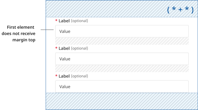
Lobotomised owl ( * + * )
We use a technique called lobotomised owl ( * + * ) to add spacing above components. This only occurs when the component follows another element. This allows us to apply a consistent spacing throughout the page.
If an element is the first child or doesn't follow an element it won't receive a margin-top.
Spacing variables and utilities
Controlling the site's vertical rhythm
Spacing within our design system is controlled globally by a set of variables categorised by their component or HTML element type. These variables define the core values that establish our vertical rhythm, ensuring consistent repetitive spacing and patterns that across all pages of a site. Using variables allows for easy updates to from a central location, making the design process more efficient and scalable.
Each variable's key-value comes from the base $QLD-space-map . The $QLD-space-map is a Sass map that defines a set of key-value pairs for consistent spacing values used throughout a design system, enabling uniform application of margins, padding, and other spacing-related properties across a website.
QLD-space-map
The QLD Space Map is a foundational element in our design system, providing a standardised set of spacing values that are applied consistently across all components and HTML elements. This Sass map is crucial for maintaining a cohesive vertical rhythm and ensuring consistent spacing throughout the user interface.
Purpose of the QLD-space-map
- Consistency: The QLD-space-map ensures that all spacing between elements, such as margins, paddings, and gaps, follows a consistent pattern. This consistency helps create a visually harmonious and predictable layout, enhancing the user experience.
- Scalability: By mapping specific spacing values to keywords or numbers, the space map allows for easy adjustments and scalability. Whether designing for mobile or desktop, the same spacing principles can be applied, ensuring the design scales gracefully across different screen sizes.
- Efficiency: The predefined spacing values reduce the need for ad-hoc spacing decisions during development, streamlining the design and implementation process. This leads to more efficient coding practices and reduces the likelihood of spacing-related issues
Example of code using variables and our space functions
It is essential that the correct variables are used when building or updating components, and that margins are always implemented using a combination of these variables and the "Lobotomised Owl" methodology.
Developers can use the function QLD-space for consistent spacing across elements on all browsers. This is done with a new unit we created, called unit , to allow designers and developers to be able to keep consistency. This function helps ensure that elements snap to our predefined 4-pixel-grid, which is set by the $QLD-unit variable.
1unit is the equivalent of 1rem , which by default is 16px .
The function QLD-space should be used to apply or padding and margin values.
Our space function is based on he Digital Transformation Agencies font and spacing functions.
/* Margin-top value * /

* + .qld__component-name {
@include QLD-space(margin-top, $QLD-margin__component--desktop);
}

/* Padding value * /

.qld__component-name {
  @include QLD-space(padding, 1unit 0 1unit 0);
}
Variables
Each of these variables should be used as the margin top value for the relevant category.
Each category has a variable for:
- desktop spacing for screens wider than 992px, optimised for more screen real estate
- mobile spacing for screens narrower than 992px, adapted for smaller displays.
Margin top values for components, containers and sections
| Category | Viewport | Variable | Value | $QLD-space-map |
|---|---|---|---|---|
| Section elements | Mobile | $QLD-margin__section--mobile | 40px (2.5rem) | 9 |
| Desktop | $QLD-margin__section--desktop | 64px (4rem) | 12 | |
| Content blocks within a section | Mobile | $QLD-margin__content-block--mobile | 32px (2rem) | 7 |
| Desktop | $QLD-margin__content-block--desktop | 48px (3rem) | 10 | |
| Components | Mobile | $QLD-margin__component--mobile | 24px (1.5rem) | 6 |
| Desktop | $QLD-margin__component--desktop | 32px (2rem) | 7 |
Margin top values for headings, text elements paragraphs and list items
| Category | Viewport | Variable | Value | $QLD-space-map |
|---|---|---|---|---|
| H1 | Mobile | $QLD-margin__h1--mobile | 32px (2rem) | 7 |
| Desktop | $QLD-margin__h1--desktop | 56px (3.5rem) | 11 | |
| H2 | Mobile | $QLD-margin__h2--mobile | 32px (2rem) | 7 |
| Desktop | $QLD-margin__h2--desktop | 48px (3rem) | 10 | |
| H3 | Mobile | $QLD-margin__h3--mobile | 24px (1.5rem) | 7 |
| Desktop | $QLD-margin__h3--desktop | 36px (2.25rem) | 8 | |
| H4-H6 | Mobile | $QLD-margin__h4-h6--mobile | 20px (1.25rem) | 5 |
| Desktop | $QLD-margin__h4-h6--desktop | 32px (2rem) | 7 | |
| Between H and P tags | Mobile | $QLD-margin__text-element--mobile | 20px (1.25rem) | 5 |
| Desktop | $QLD-margin__text-element--desktop | 24px (1.5rem) | 6 | |
|
Paragraph spacing (Margin between two P tags) | Mobile | $QLD-margin__p--mobile | 16px (1rem) | 4 |
| Desktop | $QLD-margin__p--desktop | 16px (1rem) | 4 | |
| Between list items (close) | Mobile | $QLD-margin__li-close--mobile | 8px (0.5rem) | 2 |
| Desktop | $QLD-margin__li-close--desktop | 8px (0.5rem) | 2 | |
| Between list items (wide) | Mobile | $QLD-margin__li-wide--mobile | 12px (0.75rem) | 3 |
| Desktop | $QLD-margin__li-wide--desktop | 12px (0.75rem) | 3 | |
| Labels and form hint messages | Mobile | $QLD-margin__lables--mobile | 8px (0.5rem) | 2 |
| Desktop | $QLD-margin__lables--desktop | 8px (0.5rem) | 2 |
Section spacing
Section elements with background colours applied the the qld__body classes are unique in our design system, they are an essential part of our vertical rhythm however they use padding to create vertical space rather then margin top values. This is because using margin-top values for spacing would cause the backgrounds colours within sections stack incorrectly together on a page.
| Category | Viewport | Variable | Value | $QLD-space-map |
|---|---|---|---|---|
| Section elements | Mobile | $QLD-padding__section--mobileCopy | 40px (2.5rem) | 9 |
| Desktop | $QLD-padding__section--desktopCopy | 64px (4rem) | 12 |
Utility classes
We have a number of responsive classes that can be added to html elements to override or set margin values.
They are categorised by the type of element or component you are applying space to and are useful when crafting custom layouts.
In addition to setting margin-top values there are also utility classes to remove spacing and to apply row and column gap properties for flex-box layouts.
Margin and padding spacing classes
| Class name | Desktop value | Mobile value | Description |
|---|---|---|---|
qld__margin-t-sectionCopy | 64px (4rem) | 40px (2.5rem) | Applies section margin-top values |
qld__margin-t-content-blockCopy | 48px (3rem) | 32px (1.5rem) | Applies content blocks margin-top values |
qld__margin-t-componentCopy | 32px (2rem) | 24px (1.5rem) | Applies component margin-top values |
qld__margin-t-text-elementCopy | 24px (1.5rem) | 20px (1.25rem) | Applies text element margin-top values |
qld__margin-t-pCopy | 16px (1rem) | 16px (1rem) | Applies paragraph margin-top values |
qld__margin-t-li--smCopy | 8px (0.5rem) | 8px (0.5rem) | Applies close/tight list margin-top values |
qld__margin-t-li--lgCopy | 12px (0.75rem) | 12px (0.75rem) | Applies generous list margin-top values |
qld__margin-t-labelCopy | 8px (0.5rem) | 8px (0.5rem) | Applies label margin-top values |
qld__margin-t-noneCopy | 0px | 0px | Removes any existing margin top value |
qld__padding-t-noneCopy | 0px | 0px | Removes any existing padding top value |
Section spacing | qld__margin-t-section
Content block spacing | qld__margin-t-section
Component spacing | qld__margin-t-component
Text element spacing | qld__margin-t-text-element
Paragraph spacing | qld__margin-t-p
Label spacing | qld__margin-t-label
-
Wide list spacing | qld__margin-t-li--lg applied to ul
-
Wide list spacing | qld__margin-t-li--lg applied to ul
-
Wide list spacing | qld__margin-t-li--lg applied to ul
-
Close list spacing | qld__margin-t-li--sm applied to ul
-
Close list spacing | .qld__margin-t-li--sm applied to ul
-
Close list spacing | qld__margin-t-li--sm applied to ul
<section class="qld__margin-t-section">Section spacing example</section>

<div class="qld__margin-t-content-block">Content block spacing example</div>

<div class="qld__margin-t-component">Section spacing example</div>

<span class="qld__margin-t-text-element">Text elemment spacing example</span>

<p class="qld__margin-t-p">Paragraph spacing example</p>

<p class="qld__margin-t-label">Label spacing example</p>

<ul lass="qld__margin-t-li--lg">
    <l>Close list spacing example</l>
    <li>Close list spacing example</li>
    <li>Close list spacing example</li>
</ul>
<ul class="qld__margin-t-li--sm">
    <li>Wide list spacing example</li>
    <li>Wide list spacing example</li>
    <li>Wide list spacing example</li>
</ul>
Flex spacing classes
| Class name | Desktop value | Mobile value | Description |
|---|---|---|---|
qld__row-gap-content-blockCopy | 48px (3rem) | 32px (2rem) | Content block spacing gap between rows |
qld__row-gap-componentCopy | 32px (2rem) | 24px (1.5rem) | Component spacing gap between rows |
qld__row-gap-text-elementCopy | 24px (1.5rem) | 20px (1.25rem) | Text-element spacing gap between rows |
qld__row-gap-pCopy | 16px (1rem) | 16px (1rem) | Paragraph spacing gap between rows |
qld__row-gap-li--smCopy | 8px (0.5rem) | 8xp (0.5rem) | Close list spacing gap between rows |
qld__row-gap-li--lgCopy | 12px (0.75rem) | 12px (0.75rem) | Wide list spacing gap between rows |
qld__col-gap-content-block Copy | 48px (3rem) | 32px (2rem) | Content block spacing gap between columns |
qld__col-gap-component Copy | 32px (2rem) | 24px (1.5rem) | Component spacing gap between columns |
qld__col-gap-text-element Copy | 24px (1.5rem) | 20px (1.25rem) | Text-element spacing gap between columns |
qld__col-gap-p Copy | 16px (1rem) | 16px (1rem) | Paragraph spacing gap between columns |
qld__col-gap-li--sm Copy | 8px (0.5rem) | 8px (0.5rem) | Close list spacing gap between columns |
qld__col-gap-li--lgCopy | 12px (0.75rem) | 12px (0.75rem) | Wide list spacing gap between columns |
References
Brown T (2023) More Meaningful Typography, A List Apart, accessed 3 July 2023.
Hayley A (2020) Proximity Principle in Visual Design, Nielsen Norman Group, accessed 3 July 2023.
W3C (2018) Web Content Accessibility Guidelines (WCAG) 2.1, World Wide Web Consortium, accessed 10 April 2023.
Material Design (n.d.) Spacing methods, Material Design, accessed 3 July 2023.
Digital Transformation Agency (2018) Core overview, Gold Design System (Formerly DTA), accessed 10 April 2023.
Last updated: August 2024