Overview
Promotional panels are a key element in web design used to highlight specific content or messages. They act as a visual break on a page, drawing attention to important announcements, new features, or promotional content. These panels typically consist of a combination of text and images designed to engage users and guide them toward a desired action, such as clicking a link or learning more about a particular topic.
Types of promo panels
There are four types of promo panels in our design system:
- Indented text panel
- Indented image panel
- Contained image panel and
- Full image panel.
All types support placing content on the left or right and are available in default, light, light-alt, dark and dark-alt colours.
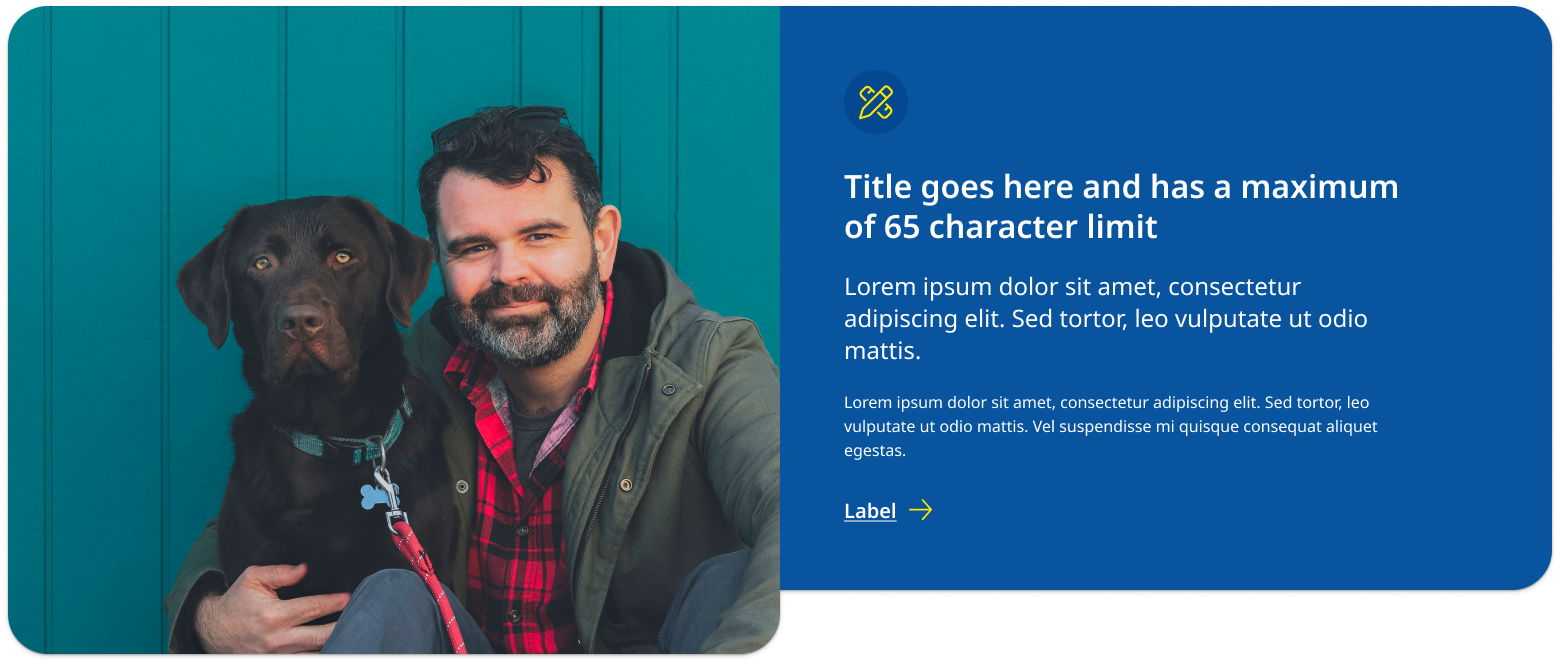
Indented text panel (larger image)
This type of promotional panel is best used when a hero image needs to be larger and have greater focus. An example would be a promotional panel where the image is used to showcase advertising campaign imagery.
View indented text example with code
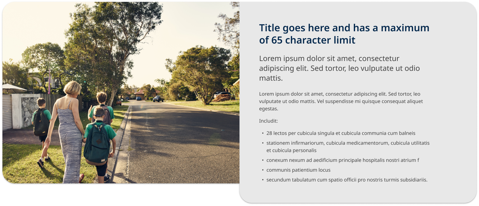
Indented image panel (larger text container)
This type of promotional panel is best used when the text needs to be larger and have greater focus. An example would be when there are many dot-points or paragraphs that require more vertical height. It is the best option when your highlighting content on a page and may not be including a call-to-action.
View indented image example with code
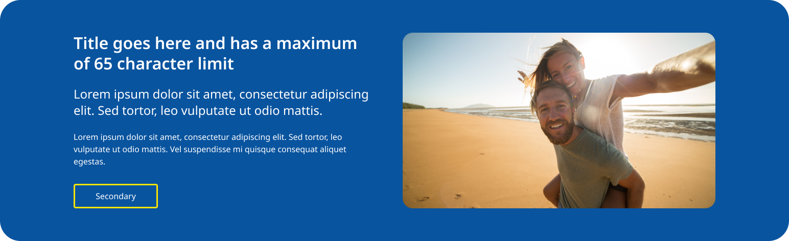
Contained image panel
This style of promo panel has a layout where the image and text are designed to have equal visual weight. It can be a useful option if you are encountering issues with image cropping and tends to work better for smaller amounts of content with one primary call-to-action. This style of promo panel has a more contained appears for that reason will look more distinct from the rest of the page's content. This is useful for content useful for the user but may not be directly related to the content on a page such as signing up for a sites newsletter.
View contained example with code
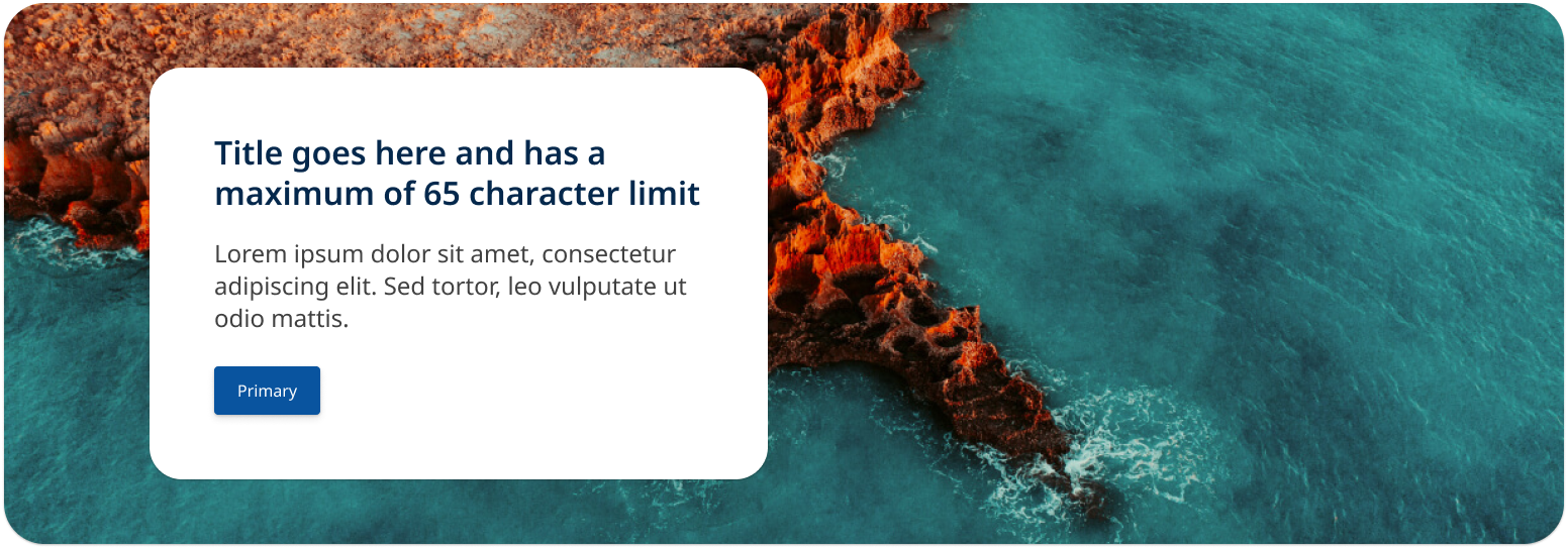
Full image panel
This style of promo panel uses a full width image instead of a solid colour as the background for the container. It is useful for promo panels that feature patterns, graphical branding and landscape imagery. Like the 'contained image panel' this design works best when there is less content.
View full image example with code
Usage guidelines
When to use
Promotional panels should be used in the following scenarios:
- Launching new features or services: When there's a new product, service, or feature, a promotional panel can effectively introduce it to users.
- Highlighting key content on a page: It may sometimes be useful to incorporate a promo panel to showcase key points, facts or a statement that needs to feature prominently on a page.
- Announcing events or campaigns: Use these panels to promote upcoming events, campaigns, or any time-sensitive information.
- Guiding user behaviour: They can be used to direct users toward high-priority actions, such as signing up for a service, downloading a resource, or participating in a survey
When not to use
It's important to avoid using promotional panels in these situations:
- Unrelated content: Do not use promotional panels to highlight content that isn't directly related to the user's current context or journey on the page.
- Non-priority information: Avoid using these panels for information that doesn't require immediate attention or action.
- On content pages: Promo panels should only be used on landing and home pages layouts and not on pages that include side navigation. This is because the response behaviour has been designed for 12 column layouts.
- On sites use vertical navigation patterns: Promo panels will have degraded appearance on vertical navigation as they are yet to be optimised for these layouts.
How to use
Do:
- Use clear and concise messaging: Ensure the message within the panel is direct and easy to understand. Users should grasp the key point within seconds.
- Keep visual consistency: The design of the panel should align with the overall visual language of the website, including colours, fonts, and imagery.
- Place the promo panel strategically: position the panel in areas of the page where users are most likely to see it without disrupting their primary task. It should not be the fist component on a page or the last.
- Use appropriate hero imagery: Above all else, you want your hero shot to be clear, there is also compelling evidence to suggest that featuring a photograph of a real-life person interacting with a product or service will get you a higher conversion rate than a photo or screenshot of a product (Gardner, n.d.).
Do not:
- Use more then one on a single page: Too many promotional panels can overwhelm users and dilute the impact of each individual panel. Try to only use one promo panel per page.
- Include too much copy: This will negatively affect the components visual layout, too much text can clutter the design and reduce the visual impact of the panel, making it less effective at catching the user's eye. Shorter copy allows for better visual balance, ensuring that key elements like images and calls to action stand out. The goal is to provide useful information to users in a way that is simple to consume and retain (Nielsen, 1997).
Design rational
Why we have promotional panels
Focusing user actions
Promo panels are strategically placed to catch the user's eye and direct their focus to specific content or actions. The foundation of conversion centred design is focus, having having one clear goal on your page will make visitors more likely to act (Gardner, n.d.).
Enhancing user engagement
By showcasing relevant and timely content, promo panels encourage users to explore more of the website or take specific actions (Gardner, n.d.).
Emphasising content
Promo panels assist in emphasising important information that might otherwise be overlooked if presented in a standard content block (Gardner, n.d.).
Reducing the chance of banner blindness
Promo panels were designed provide users with a way to highlight content in a way that is consistent with a design that aligned to the look and feel of overall site. This is important because if promo panels appear too distinct they may look like advertisements banners. Designers think that by making content look really distinct from the rest of the site that it will increase its salience however this often has the opposite effect (Nielsen, 1997) as users will often ignore content they consider to be an advertisement, this behaviour is called banner blindness, you can read more about banner blindness in this Nielson Norman Group article.
Providing a pattern to anchor images left or right without scaling issues
At large screen sizes images that are anchored to the right or left of a page can become distorted or cropped poorly as they scale horizontally. This a common issues that makes choosing images for websites challenging. The promo panel addresses by having a fixed max-width of 1600px, once the panel reaches this width it will prevent images from scaling and being cropped too dramatically.
Layout and overlap effect
The promo panel is designed to highlight feature content and create a distinct visual break on the page.
The promo panel is designed to highlight feature content, creating a distinct visual break on the page. This component interacts uniquely with other content sections, ensuring that it stands out within the overall layout. The use of contrasting background colours, elevation, and overlapping margins further enhances its visibility, making it an effective tool for drawing attention to key information.
The slight overlap and background shadows create the impression that the promo panel floats above other sections on the page. By placing the promo panel at a higher elevation than other elements, the design directs the user's focus to its content. This approach is inspired by the principles of Material Design, which emphasises the use of elevation to convey hierarchy and importance. In Material Design, elevation is used to indicate the relative importance of elements on a page, with higher elevation levels suggesting greater prominence.
For more details on how elevation is used to create this effect, you can refer to the Material Design guidelines on elevation.
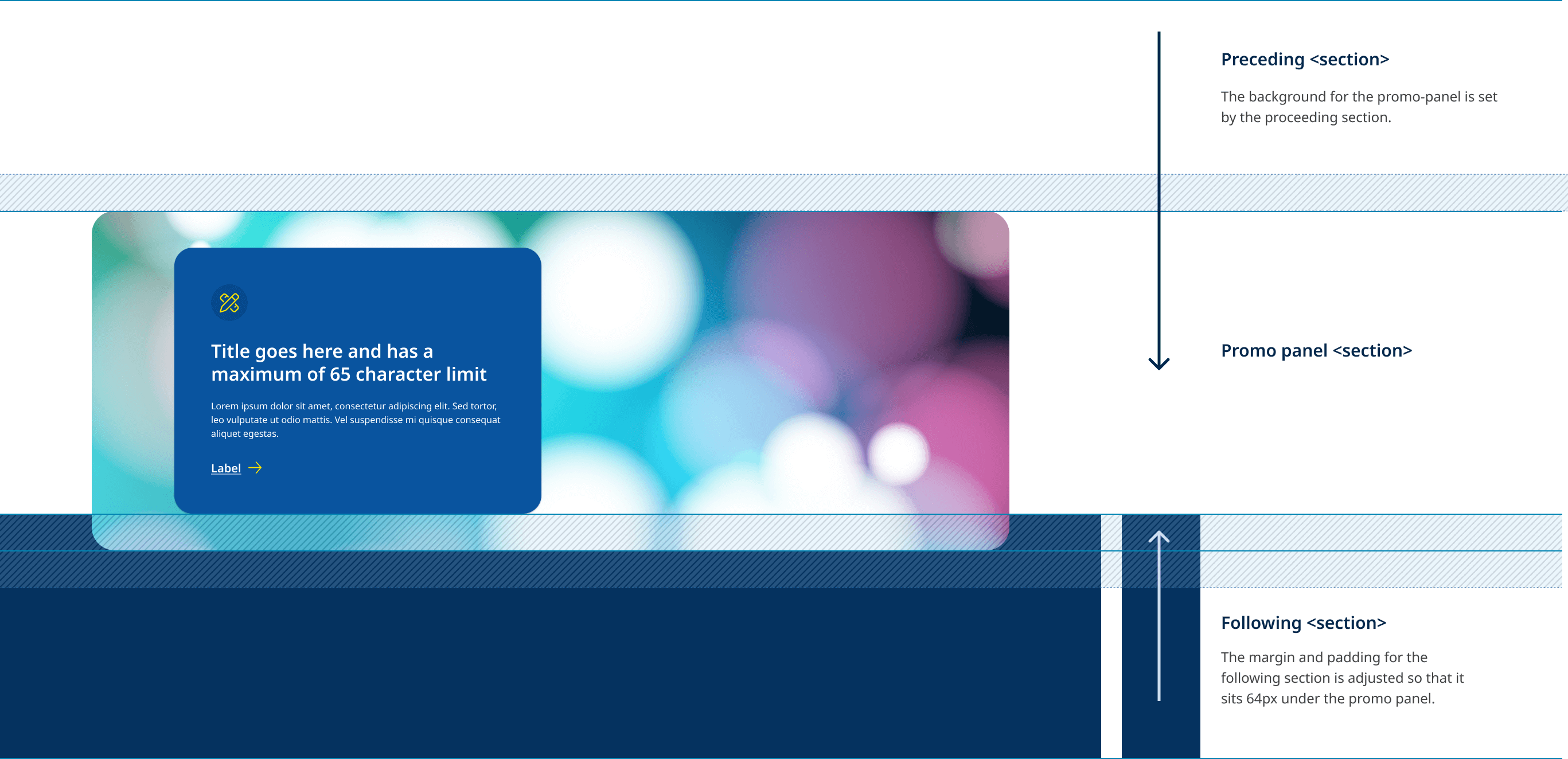
When using the promo panel it is important to understand how the component interacts with sections that preceded and follow it. The diagram below illustrates the how the background colour for the promo panel is inherited from the section before it, while the padding and margin of the following section are are adjust the create the overlap effect.
Overlap example
View live example of overlap and elevation behaviour.
Classes
| Name | Description |
|---|---|
qld__promo-panelCopy | This class defines the overall styling for the promotional panel, which includes layout, background, and general presentation. It is a foundational class that identifies the section as a promotional panel. This class also sets the default appearance for the promo which is the indented large image pattern. |
qld__body | This is the default qld body section class, using it alone will apply the white background colour the to the qld__promo-panel__container |
qld__body--light | This is modifier class that applies the light background colour the qld__promo-panel__container |
qld__body--alt | This is modifier class that applies the alt background colour the qld__promo-panel__container |
qld__body--dark | This is modifier class that applies the dark background colour the qld__promo-panel__container |
qld__body--dark-alt | This is modifier class that applies the dark-alt background colour the qld__promo-panel__container |
qld__body--large-text | This is a modifier class that applies the styling for the indented text promo panel variant. |
qld__body--contained | This is a modifier class that applies the styling for the contained image promo panel variant. |
qld__body--full-image | This is a modifier class that applies the styling for the full image promo panel variant. |
qld__promo-panel--image-left | This is a modifier class specifies that the image within the promo panel should be aligned to the left side of the content. It influences the layout by positioning the image container to the left. |
qld__promo-panel--image-right | This modifier class indicates that the image within the promo panel should be aligned to the right side of the content. It adjusts the layout by positioning the image container to the right. |
qld__promo-panel__container | This class is applied to the container that holds the content and image of the promo panel. It typically controls the layout and spacing within the panel, ensuring that the elements are displayed in a row. Its colour is determined by the qld__body colour class applied the the section. |
qld__promo-panel__container-image | This class is used for the container that holds the image within the promo panel. |
qld__promo-panel__imageCopy | This class applies styles to the image itself, including the background image settings such as |
qld__promo-panel__container-content | This class is used for the container that holds the textual content within the promo panel its sets width of the content. |
qld__promo-panel__container-inner | This class is applied to an inner container within the content area. It provides additional structure and spacing, often used to group related content elements together. Its what controls padding and background shadows for the content section. |
qld__promo-panel__container-icon | This class styles an icon container in promo panels. |
qld__promo-panel__icon | This class specifically targets the icon itself, applying necessary styles such as font size and colours. |
qld__promo-panel__container-btn | This class is applied to the container that holds buttons within the promo panel. |
Accessible promo panel requirements
Keep these considerations in mind if you're modifying the Design System or creating a custom component.
WCAG guidelines
1.4.3 Minimum contrast
Promo panels should use appropriate contrast to ensure that all users, including those with low vision, can read the content. The text should have a minimum contrast ratio of 4.5:1 against the background W3C (2018).
2.4.4 Use descriptive link text
Any links within the banner should have descriptive link text that accurately describes the destination of the link. This helps users with screen readers and other assistive technologies to understand the content W3C (2018).
2.4.6 Headings and Labels
Headings should be used to structure content logically, ensuring that users, including those using screen readers, can navigate and understand the content hierarchy. Each heading level should be used sequentially (e.g., H1 followed by H2) to reflect the structure of the page content accurately. This practice aligns with the W3C guidelines (W3C, 2018).
References
Gardner O (n.d.) The 7 Principles of Conversion-Centered Design, Unbounce, accessed 16 August 2024. The 7 Principles of Conversion-Centered Design.
Nielsen J (1997) How Users Read on the Web, Nielsen Norman Group, accessed 16 August 2024. How Users Read on the Web.
Google (n.d.) Elevation, Material Design, accessed 16 August 2024. Elevation.
Last updated: August 2024