What's the deal with 'asides' or 'right rails' on websites?
When we were working on updating the health.qld.gov.au website, we came across the "aside" or "right rail" design pattern, which is used by many government sites including Qld.gov.au. It was not included in the DTA or the Qld Health design system and thus we hadn't given any guidelines about this pattern. So, we decided to dig deeper and understand it better.
What did we find out?
A lot of websites have these side sections (asides) to show extra info. But our research found out that they might not be such a great idea. Here's why:
- Banner Blindness: Users often ignore things on the sides of web pages. They think they are ads because, traditionally, that's where ads are placed. So, even if it's not an ad, people might just scroll past it.
- Gestalt's Law of Proximity: This is a fancy way of saying that if two things are close to each other, we think they're related. So if there's an ad and some important info next to each other, users might think both are ads and skip them.
- Right-Side Neglect: When people browse websites, they spend 80% of their time looking at the left side. So, stuff on the right? It usually gets ignored.
- Exhaustive Review: If users can't find what they're looking for easily, they get annoyed and may have to keep scanning the page over and over. That's not a great experience.
- Mobile Limitations: On phones, these side sections usually get pushed down below the main content. Approximately 60% of our traffic is via mobile, which means the majority of people view the content this way.
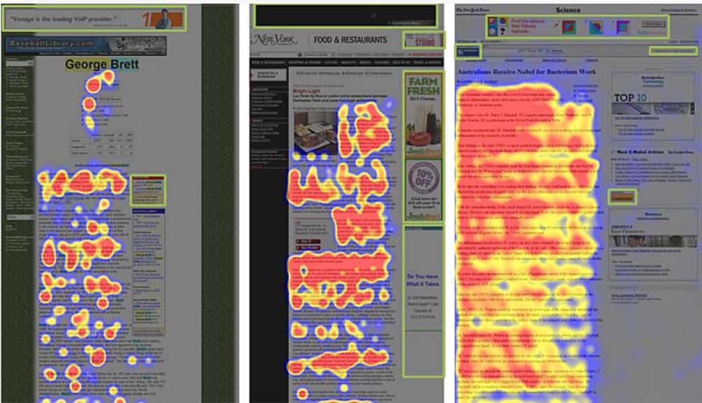
Example - Heatmaps from eye tracking studies showing the areas where users looked. Red indicates the most looked at areas, with yellow with fewer views, blue with less again and grey with no views. Green boxes were drwn on the images to indicate areas with promoted content.
So, what's the verdict?
Based on our findings, it's best to avoid using those side sections for important content. Instead, make the main part of your page easy to read and navigate, and keep the most important stuff there. Our thoughts are, if the right rail has all these draw backs and over 60% of users are mobile and won't see it anyway, we may as well be consistent and place any complementary content below the main content.
If you do use the right rail, it should only be used for complementary content , not primary content. Also avoid putting any promoted content in there, if user's get a hint this content may be ad like they will assume all content is promotion and likely ignore it.
Last updated: August 2023