Side navigation
Our content page layout is based on the NSW, DTA and SA design system layouts. However the key variation in our pattern from the DTA (much like NSW and SA) was moving the side navigation back to the more expected position on the left hand side.
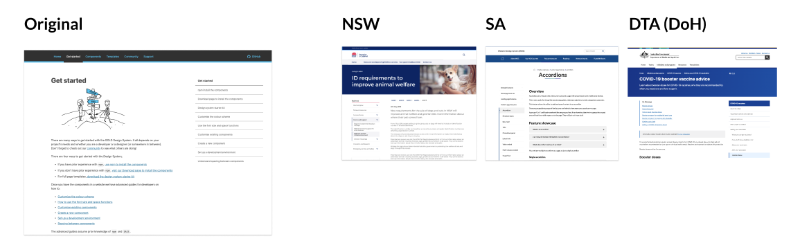
This choice was supported by several studies and is more common website layout convention that is already familiar to users.
We know from eyetracking studies that attention leans left on websites: users look at the left half of the screen 80% of the time. The real estate on the left side of the screen is valuable, and placing your navigation there makes it likely to be noticed and scanned by your users.
https://www.nngroup.com/articles/horizontal-attention-leans-left/
The resulting pattern is then similar to that used in the NSW design system.
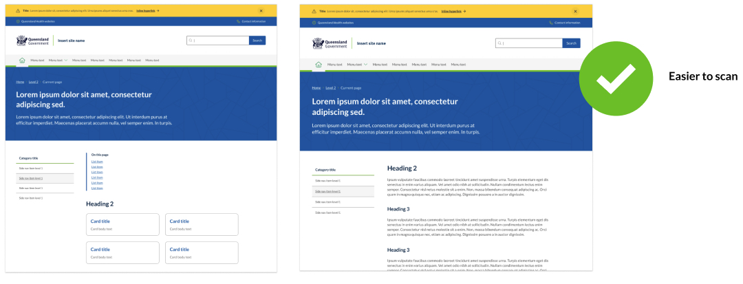
Primary Heading (H1) alignment
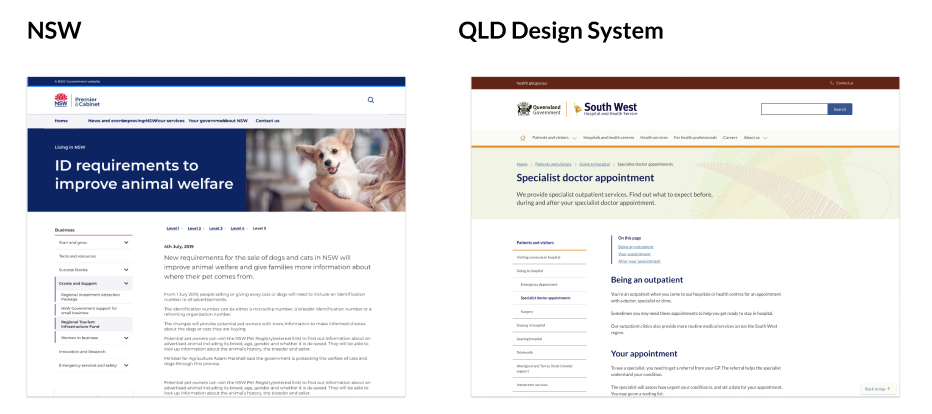
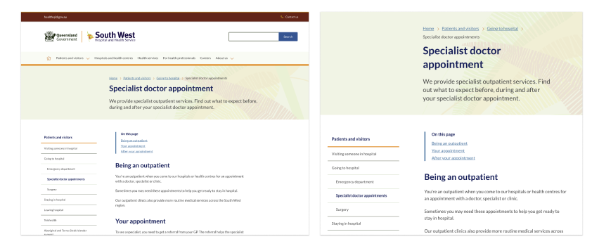
The design system allows the use of banners on content pages. In our initial community consultations a question was raised around the placement of the primary H1 heading in relation to the body content of a page. This is because in our existing banner pattern the H1 sites above both the side navigation and the body content, meaning the H1 is not immediately aligned with the body content.
In considering this issue, it's important to understand user research around how people read webpage content.
Is this a problem?
When looking at the issue there is some key research to consider as well as the findings from our usage of the current pattern across the 15+ existing design system websites that have been implemented to date.
People generally scan pages and not read them.
One of the things to consider is how people read content on the web, On websites 79 percent of Web users scan rather than read.
This scanning behavior results in an eyetracking pattern that resembles the capital letter F. In left-to-right languages, text on the left and towards the top of the page is read more...
https://www.nngroup.com/articles/why-web-users-scan-instead-reading/
This suggest that placing the H1 on the left in a banner may mean that it will be noticed more quickly by the user. They will then move on to scan to other secondary content on the page mostly likely looking at headings which is what is suggested in other eye tracking research (Spotted Pattern).
Breaking content into chunks actually makes it easier for users to interpret content
Having the title and abstract contained in the banner may enable the users to interpret content more easily and quickly decide if its relevant to them.
Users appreciate chunked text content. It helps avoid walls of text, which can appear intimidating or time-consuming. Chunking enables easy skimming — users’ preferred method of reading online.
For when people are not scanning
Another common eye tracking pattern is the commitment pattern, this demonstrates traditional reading, not scanning. In this pattern, users fixate on all or most content words in the text passage. This pattern usually occurs when users are very interested or very motivated to read the content (for example, because they are studying for a test, or need to return an item on a specific site and are reading the instructions to do so).
https://www.nngroup.com/articles/text-scanning-patterns-eyetracking/
This is something that content designers need to take into account, if you know users are not going to scan text you should consider an alternative layout.
Example
One instance where we have addresssed this in in our article template designs. This design ensures the content and headings are aligned in a trandational manner for blogs and news articles where users are more likely to read content rather then scan it.
Observations so far
The Qld Health Digital Transformation conducts a 90 day review process on all sites we deliver, which includes analysis of Hotjar session recordings looking for behaviour which indicates user frustration including getting lost, U-turns, frustration clicks. Through this analysis we have not observed any users struggling to associate page titles with content.
Existing options
Not using a banner
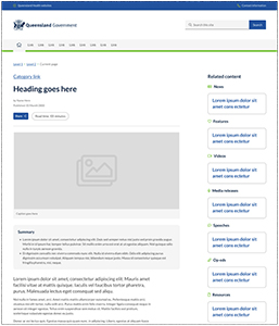
The main issue with the layout is when you combine the ‘left-side navigation’ and ‘banner component’ on a content page. In this instance the H1 and the content become misaligned. There is an existing option to avoid this issue called the 'No banner' pattern. As the banner itself is not mandatory, when a banner is not used, the H1 heading of the page is displayed inline with content.
 The ‘no banner’ option is a useful solution for content pages and is what is done on many other systems. However, it does have few issues. It stands out less, has reduced options for branding and creates inconsistency for H1 positioning across a site. It is also generally recommended that pages of the same kind follow the same patterns across a site so mixing and maxing banner options for content pages is not ideal.
Using abstract text or secondary headings
By using abstract text and secondary headings you can help the users to interpret content on the page by creating visual hierarchy and chunking content. This reduces the visual disparity caused by the misalignment of the H1 from the content.
What are the other options for handling this?
The alignment of the h1 is an issue that we investigated during our initial design process. We attempted to resolve the problem but ran into a number of issues. We identified two potential solutions initially but each had drawbacks.
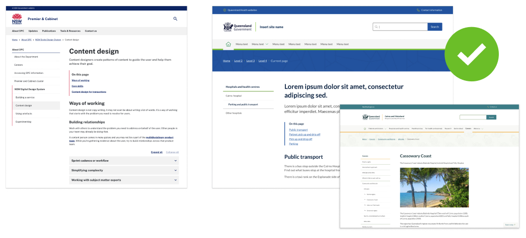
Centred text ’SA approach’
South Australia offers a solution where they centre the H1. We looked at this, however it was rejected because it creates inconsistency with the layout and positioning of breadcrumbs and titles opposed to the rest of the site. Consistency wherever possible is paramount in our design system values. It also makes banner design inconsistent from each other and only works when there are no images.
Furthermore, providing a centred text option in the banners was not deemed a good idea as when titles or abstracts are too long centred text inhibits readability.
Aligned to grid
We also investigated methods of incorporate gird alignment but ran into uses with spacing on smaller screens and decided that it was also wasting primary screen real estate.
Future evolution
After receiving feedback during the design system consultation process around this alignment issue, we looked at the issue again and came up with an alternate option, where the side navigation itself is pulled into the space reserved by the banner. This concept would need to be tested and validated.
 There are many things to consider with this approach, including placement of breadcrumbs, the added inconsistency between other page layouts and banner designs and the need to update and modify the side menu pattern and its behaviour. Finally this option removed the ability to set hero images in the banner, which removes a key space to utilise display imagery, which likely would mean more cases of it being included in the content itself, potentially an undesirable side effect.
Conclusion
We ultimately decided given user eye scanning behaviour and the benefits of the banner component as a space for branding and imagery, that the placement of the H1 was a low risk. The banner pattern is also not mandatory to use, site owners/content editors have the choice to use the ‘No-banner’ option where H1 is bound to body copy.
With the research from Nielsen Norman group supporting people scanning the page in a pattern that supports the existing layout, it means the risk of people getting lost is so far an unproven hypothesis. However we remain open to new research or new user observational data showing more conclusive results around this.
Finally the future state option could still be considered as an alternate pattern as a future improvement for the design system.
Last updated: August 2023