Acknowledgement of Country
The Acknowledgement of Country (AoC) has been repositioned in the footer so it’s more visible. We’ve also enhanced the footer component in Figma so it's easier to use.
Breadcrumbs update
The breadcrumbs component has been optimised to better handle long breadcrumb trails. This prevents links from wrapping over multiple lines, which can disrupt and clutter designs in small spaces.
New tokens and variables
We’ve made a number of improvements to our tokens and variables in our design system file to support Figma's new variable features.
We added and refined our spacing variables to support logical naming conventions, and included new underline, border width and radius variables.
This update is part of a broader initiative to align our Figma file with our CSS variables, so the correct values are being used. We've also incorporated the BEM (Block Element Modifier) methodology for a unified design-to-development workflow.
These tokens now match the CSS variables our code and can be used as a foundation when updating or creating new components.
New Figma guidelines
We’ve updated our guidelines and documents to make it easier for you to use and customise the QGDS components in Figma.
Before you update
The updates to the footer and breadcrumb components are designed to be backwards compatible. Before updating to the latest version of our design system, we recommend duplicating your original file and testing the update in that version first.
What's new
Core styles
We have new spacing tokens in Figma to match the variables in our code.
These include new:
- spacing tokens
- underline tokens
- border width tokens
- border radius tokens
We’ve also updated layout styles and descriptions
Component updates
Updated footer component
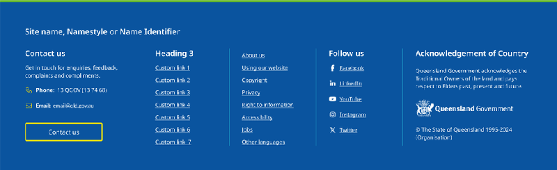
- Added a heading above the AoC message.
- Repositioned the AoC above the Queensland Government Coat of Arms and copyright text.
- Optimised component in Figma, so the site name, AoC message, and copyright text can be updated in the component property panel.
Updated breadcrumbs behaviour
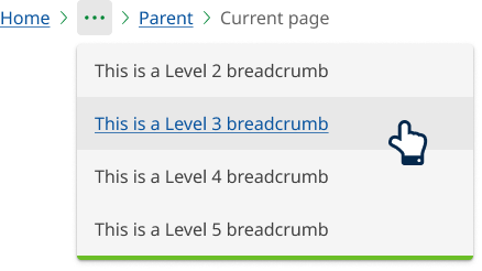
We've added a variant called Overflow to the breadcrumbs component,so they now collapse into an overflow menu when there isn't enough room to display all links on one line.
When there isn’t enough space, page titles will be shortened with an ellipsis (…) to show they’ve been cut off. And an overflow menu will be used for additional items, preventing the title from wrapping onto multiple lines.
New overflow menu component
We’ve added a new overflow menu component to the design system, but it can only be used with breadcrumbs. It’ll be expanded to be a separate and reusable component in a future release.
Quotes and promo panels
We’ve moved quotes and promo panels from the Figma page structure to core components. They’re now included in the core release and their position in the Figma file structure has changed to reflect this.
Figma guidelines
Getting started section
We’ve expanded our Getting Started section, and introduced the following 2 new sections to help you get up and running in Figma.
Foundational pattern documents
We’ve added to our foundational documents for the following 3 patterns.
Figma components
The Component library in Figma now includes guidelines for Figma components, with links to more resources and instructions on editing components.
Properties panel
Thedesign system components now have documents in the properties panel. You can find them by clicking the 'show more' link when you hover over 'about this component'. These guidelines have a brief overview of each component, its variants, and links to more documents on our design system website and in Figma.
Bug fixes
- The code syntax for some colour variables has been updated, and we’ve removed duplicated colour variables.
- The corner radius on the promo panels, and corner radius documents have been updated to align with the XL value in code of 40px.
More about this update
Component guidelines
Our Figma file is always evolving and incorporating new features, such as enhanced variants, auto-layouts, and more recently, tokens and variables.
We’re committed to improving our Figma components to take advantage of these new capabilities. As a result, some components are still in legacy formats, which may need different editing steps.
We’ve created detailed guidelines to help you use and edit our components. If you need more support, email QGDesignSystem@qld.gov.au.
If you’d like more information about this update, you can read our research and design documents in Figma.
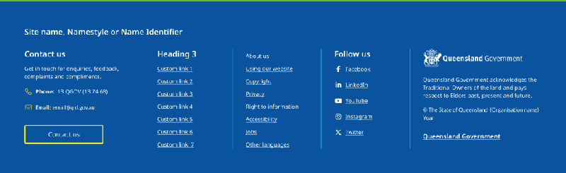
Acknowledgement of country
We received feedback that the placement of the AoC wasn’t prominent enough. And its position between the Queensland Government Coat Of Arms and the copyright text might undermine its significance. To address this, we’ve added a header to the AoC and repositioned it away from the coat of arms and copyright.
If you’d like more information about this update, you can read our research and design documents in Figma.
Before
After
Breadcrumb behaviour
As government agencies, we often have large websites with deep content. This can result in long breadcrumbs that break over multiple lines, taking up vertical space and adding to cognitive load.
After considering various options, we found that an overflow menu provides the best user experience. It manages space well and keeps the interface clean and easy to navigate.
The overflow menu pattern is intuitive, accessible, and user friendly. It’s used by IBM Carbon Design system, Atlassian Design system, Microsoft Fluent 2 and Material Design. The menu pattern will be expanded to be a separate and reusable component in a future release.
Last updated: August 2024